Watch Out For Fakes!
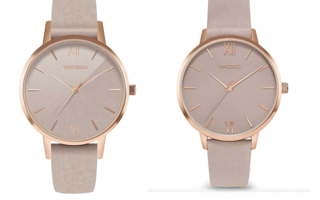
For this project my goal was to make a photorealistic looking watch using only vector graphics. This task seemed daunting at first, almost impossible I might add. But after about 40 hours of work in Illustrator, I am happy with my results. To begin, I used this beautiful Vincero watch as my inspiration! I loved how simple it was yet elegant. My objective in creating this watch was to maintain its classy and luxurious appearance. The difficult part of creating a watch is that it has many reflections, highlights, and shadows. While doing this project I hoped to gain a better understanding of the tools available in Illustrator and how to create a realistic graphic.

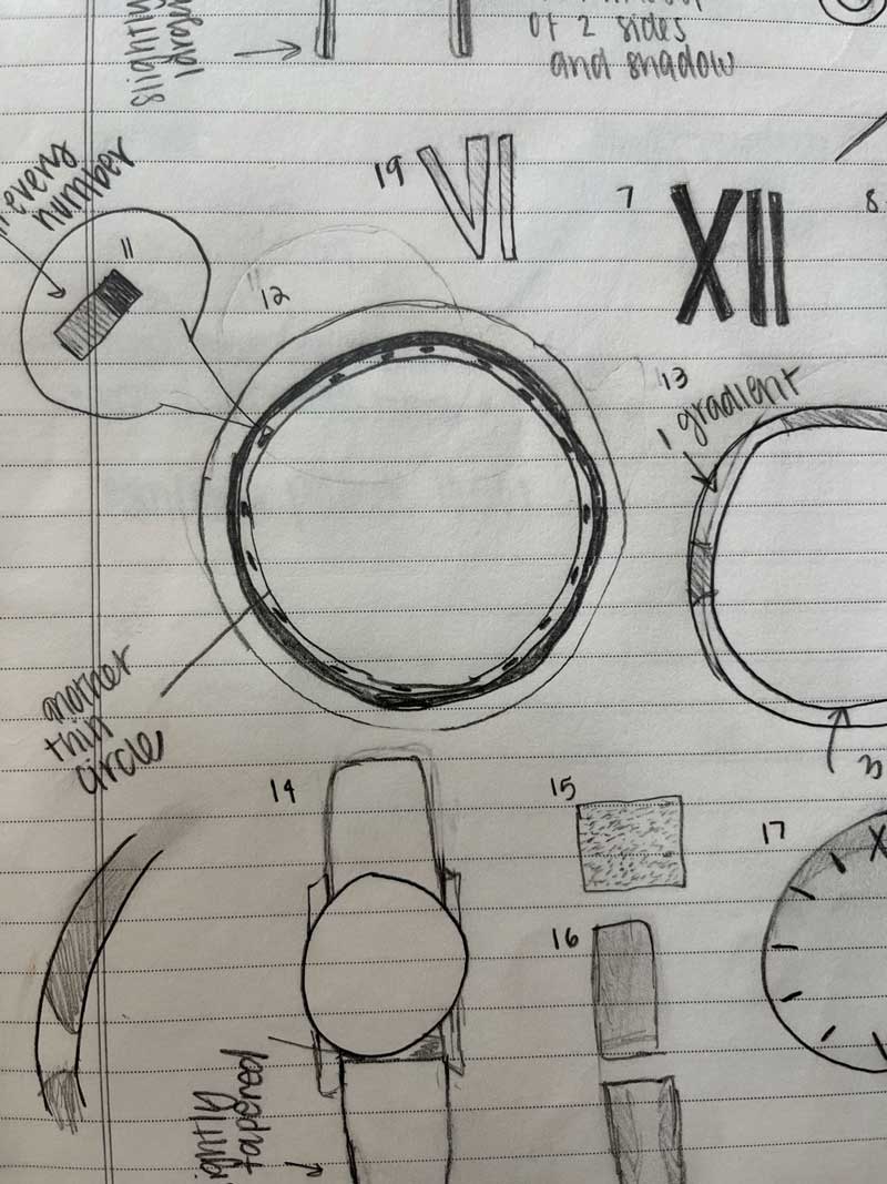
To the Sketch Book!
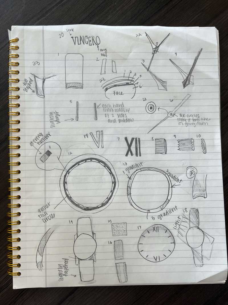
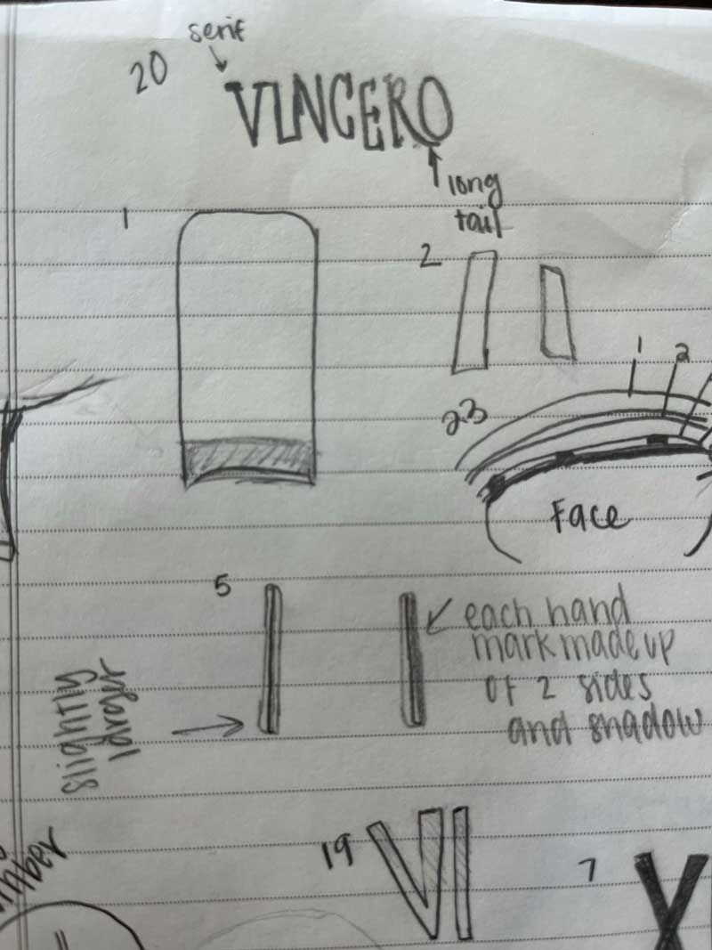
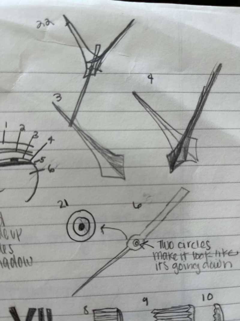
A Watch is Born

In the first drafting stage focused on using basic shapes to create the structure of the watch. I also was careful about using rulers and guides to ensure that everything in the watch was symmetrical. The rotate and reflect tools proved to be extremely helpful in this process. I also found a font that was similar to the brand Vincero. I did the roman numeral styles letters on my own using rectangles. I was very pleased with how my watch was coming together after the first draft.
Time is Ticking: Improvement


Application
I tried my best to color match the knob from the watch photo and then added a gradient above it. This little knob took me a long time to do. It was difficult to add multiple different gradients on top of lots of little, tiny pieces. However, after reaching out to a few peers for help I was able to accomplish my goal.


Final Product

After hours of work and fine editing this is my final result. I am happy with the way it turned out and think that it looks like a photorealistic watch. I focused on using warm, rich colors and using multiple layers and masks to give the watch a subtle but realistic metal look. I was able to add highlights or shadows in specific areas by using the draw inside tool. I gained a greater capacity to problem solve and feel more comfortable in Illustrator. I learned how to use tools such as masks, contrast, blurs, textures and gradients. I also really loved the texture I found and made the biggest difference in making it look photo realistic. There is obvious improvement from the first draft to the final and I am happy with the result. I cannot wait to continue expanding my Illustrator skills!
0 Comments