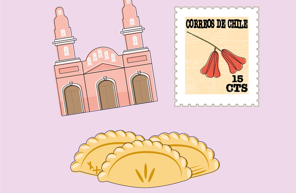
¡Viva Chile Sticker Set!

I wanted to make stickers that were both cute and represented something important to me! Stickers that I could not find anywhere else. I started brainstorming ideas and remembered my mission! I served as a missionary of The Church of Jesus Christ in Rancagua, Chile. I LOVE Chile- the architecture, the bright colors, the food, the small houses, and the old rustic feel of the country! As you can tell I pretty much loved everything about that country! I decided to use Chile as my inspiration! I immediately knew that one of my goals was to represent the happy, upbeat, fun spirit Chileans have. I thought the best way to do this would be incorporating lots of fun bright colors. I also did not want the designs to be overly complex. Chileans are easy-going people and they do not have a lot. Additionally, I wanted my designs to reflect their simplistic lifestyle by keeping my designs simple as well.

Die Cut Stickers- Perfect for laptops, water bottles and more!

Drafting

I had a lengthy list of ideas of objects, symbols, places, and foods that are icon in Chile! I decided that I wanted to incorporate the national Chilean flower, the Copihue or Chilean bellflower. However, to make the design a bit more interesting and unique I decided to incorporate it onto a stamp. The most well-known and touristy spot in my mission was the pink cathedral in Rancagua. I love the architecture and the bright colors! Last, I wanted to showcase the unique Chilean houses. Each one is so different and colored very differently. I Planned to do a row of four houses each one a distinct color, style, roofline, fence etc. I used pictures I had taken on my mission as well as a few reference photos and began sketching. This is what I came up with. I also wanted something unique to add to my design and further unify the pieces. While I was sketching, I thought it would be neat to try and do an offset stroke on each sticker as well.

A work in progress

I asked a few friends for feedback and they said it felt odd to have two buildings and one stamp together in set. The suggested getting rid of one of the buildings and creating something else that represents Chile. I agreed with them and decided to do the popular Chilean food- empanadas! Since the houses were quite small and overly detail oriented for my simplistic design goal, I decided to put that graphic to the side. Besides working on my empanada more, I was told to work on the offset outline, especially on the cathedral. Last, I was advised to make the stamp edge less wavy and more perforated.

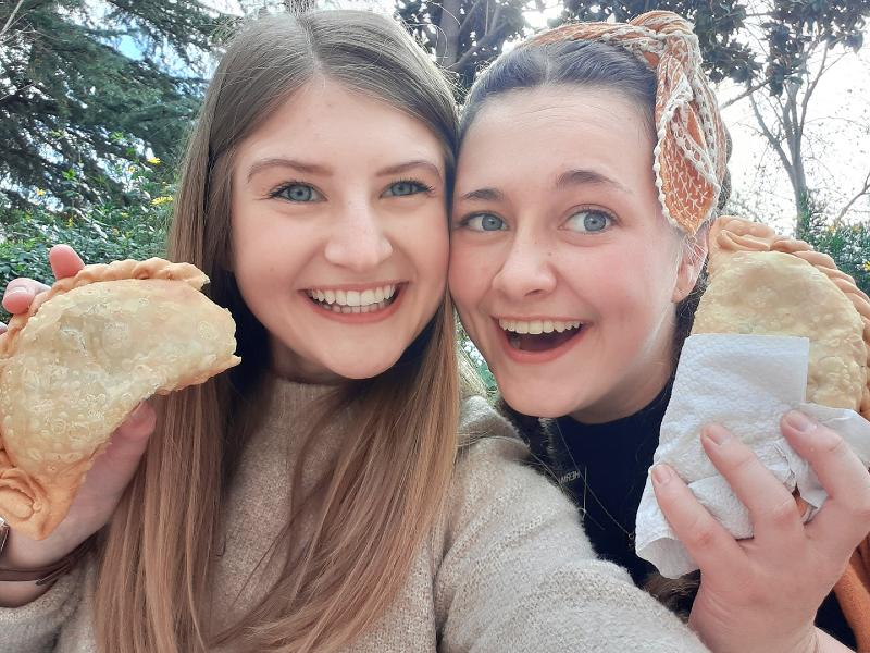
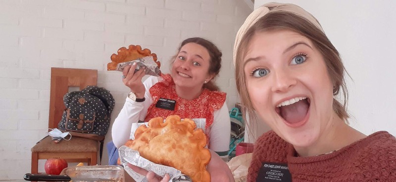
I applied the feedback they gave me and continued working on the empanada. I used pictures from the mission to really help with this. Every empanada is so different; some are baked, some are fried, some are square, and some are round. I chose to make the scallop-like crust (because that was my favorite kind) and wanted the dough to fold over one another. Here is my process from my original empanada to the final.  

I also worked on the stamp edge a lot and played around with lots of different strokes and color combinations. Here’s how I improved:

¡El Producto Final!

After LOTS of drafting this was my final design. I am happy with the way the stickers turned out. Glancing at the stickers you can tell there is a happy mood. The bright colors create a fun, party-like atmosphere. I feel I did an excellent job keeping the designs simple, yet recognizable. I tried not to add so many details in the cathedral and simplified the final stroke.

The flower on the stamp is simple, yet elegant. Furthermore, the empanada has a few shadows and highlights, but few other details to preserve the simplistic nature of it all. I sent my final sketch some of my Chilean friends at they said, “GUAU!” (“WOW”) They recognized all the stickers and loved them!

See my work on Behance

0 Comments

Submit a Comment

Your email address will not be published. Required fields are marked *

Join

Work With Me