Summer in Idaho Set

I was tasked with creating a series of 12 related icons that reflect something about myself. The inspiration for this icon set came after living through three consecutive winters. Anyone who knows me, knows that I love warm weather! After months of cold, snowy, and gloomy days my mind has been endless daydreaming of sunshine, flower fields, and the lake.The anticipation of my first Idaho summer seemed like the perfect theme.  
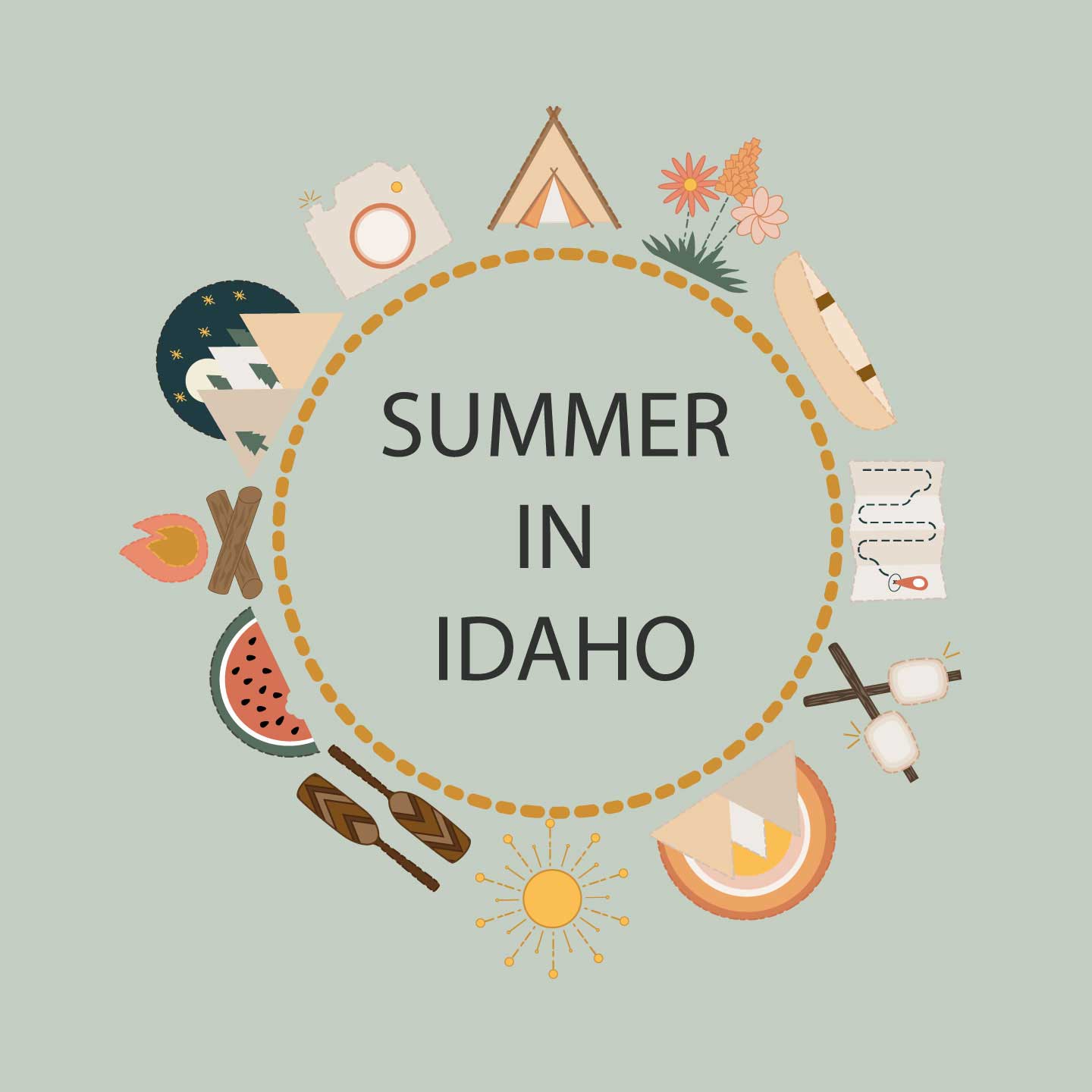
My overall objective with this icon set was to showcase what “A Summer in Idaho” looks and feels like. 

When I think of a summer in Idaho one word comes to my mind- adventure! Because of Idaho’s large mountain range, national parks, and beautiful scenery I knew that many of my icons would encapsulate the outdoors in some way. I live in a small town in Idaho, where everyone is so calm, happy, and enjoys the simple life! Because of that I did not want to make the icons appear too complicated with lots of detail. My objective was to reflect happiness, simplicity and enjoyment of living in this great state. The process of creating these icons included sketching, designing, more sketching, peer feedback, and multiple rounds of revision. Let’s look at these steps in greater detail.

Program Used: Illustrator

Ideas & Sketching 

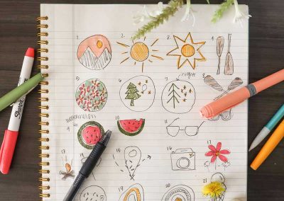
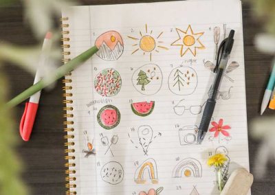
Ideas List (aka- brain dump!)
Greenhouse – Watermelon – Swimsuit – Sunflower – Sun – Pineapple – Mountains & tree – Rainbow – Ice cream – Hiking footprints – Sunglasses – Night sky – Bonfire – Smores -Camera – Grill – Travel point – Hammock – Canoe- Star gazing – sunglasses – rainbow – canoe paddles – sunset

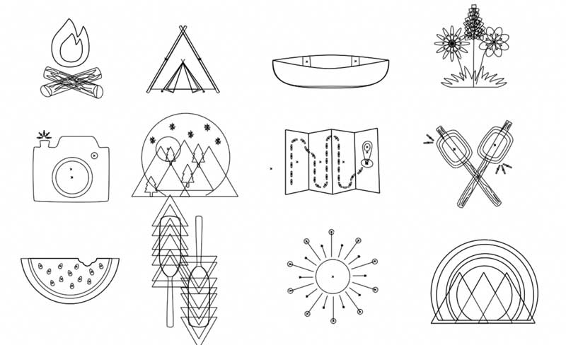
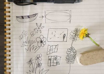
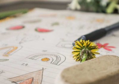
I began with a brainstorming session. I listed a bunch of ideas that came to my mind when I thought about the summer. Then I sketched out 25 different variations of my favorite ideas from the list. During sketching I tried not to overthink or be too complicated with my designs. I wanted them to be simple and easily recognizable. I also did not want any overly sharp edges. Summertime to me means a worry-free state of mind. I did not want these icons to feel tight or trapped in, so I tried to avoid any hard lines or corners in my design process.  

A very rough draft
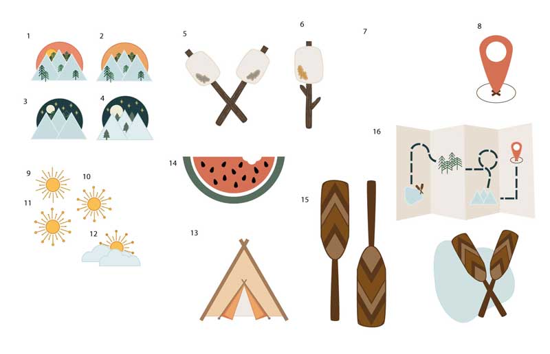
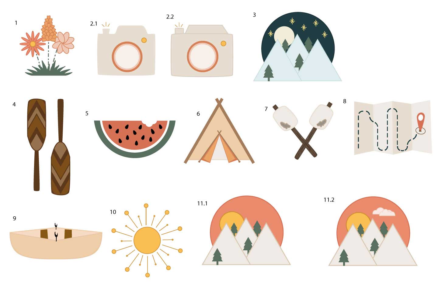
During my first drafting process it was a lot of figuring out what style I wanted things to look like. Easily recognizable, simple icons was my goal. I used a stroke on some of them and tried to incorporate similar colors in all the designs.

Feedback & more drafting

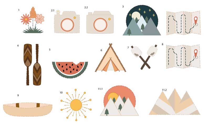
After the first draft I received some feedback which included: simplifying the bark, changing the toasted part of the marshmallow, working on how the handlebar attaches to the paddle, adding thicker strokes to the paddles and changing all the other strokes so that the darker color was on the outside. A lighter stroke on the outside, like on the mountains, gives off a glowy look and that is not what I wanted. So, after some more work this is what the second draft looked like:

This is Idaho

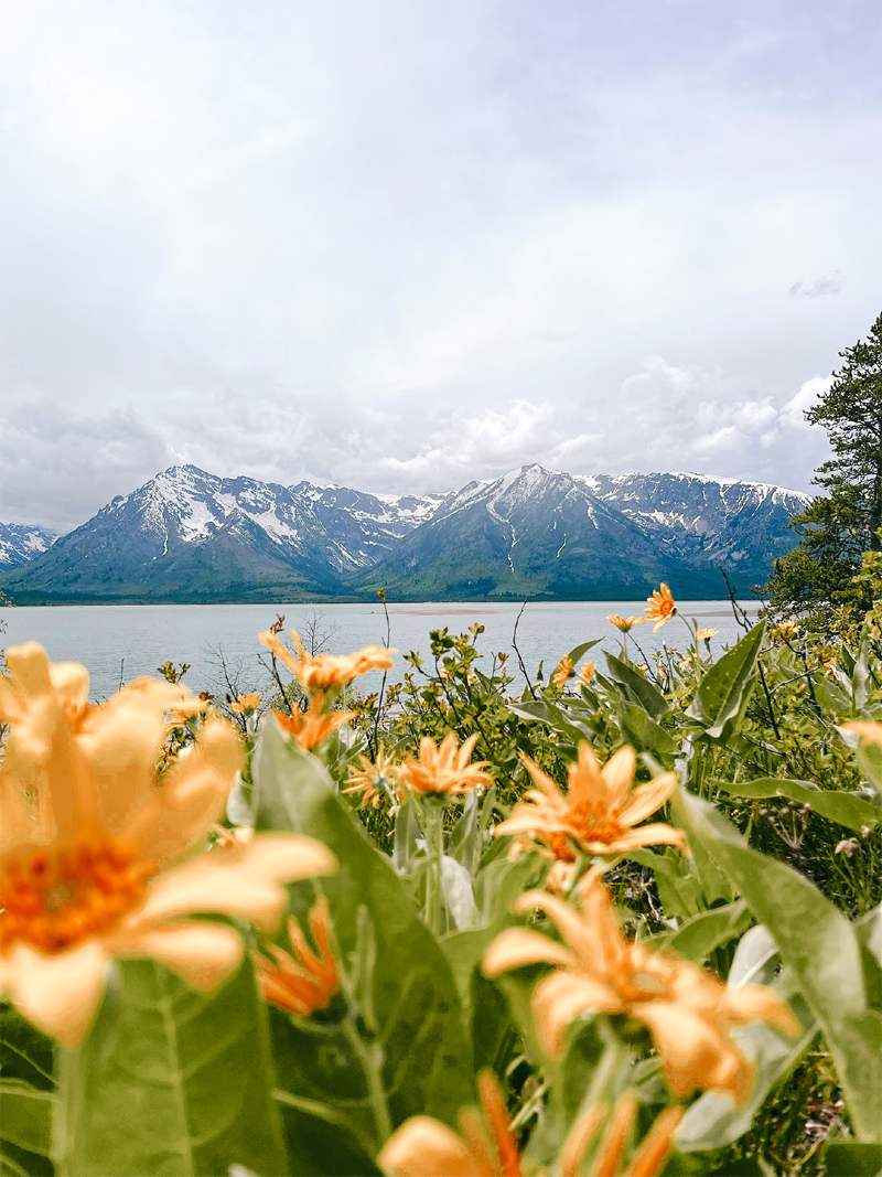
The Grand Tetons, St. Anthony Sand Dunes, Island Park

One icon that was especially hard for me to nail down was the roasted marshmellow. Here was my process:

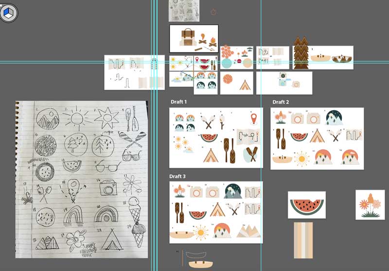
As you can see below I went through MANY draft rounds and more sketching. I tried lots of variations, patterns, colors, stroke types etc. Each round became a little more defined and I could slowly see my designs coming together. 
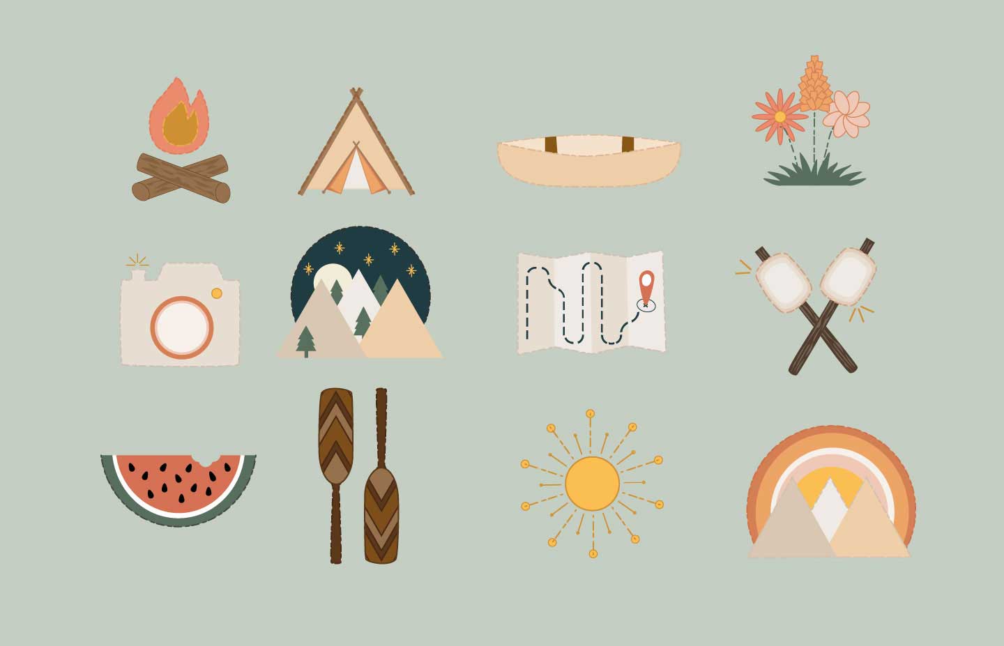
After some more revisions, I felt there was still something missing. There needed to be a more unified and distinct design element. I decided to embrace the idea of a summertime worry-free state of mind! To give the icons a more freeing look, I changed the stroke on every icon to be dashed and rounded. As you can see above, this gave them more “breathing room” and was a fun, adventurous detail to add. The change in stroke and simplifying all the colors so they matched immediately brought all 12 icons together!

The Final

After making all the adjustments, this was my final product. I really love the way it turned out! Overall, these designs meet my objective to create a simple and happy “Summer in Idaho” themed icon set. I was able to achieve the simple look by keeping the designs 2D and only sketching the most important, distinguishing parts of the icons. The warm, bright colors portray happiness. Furthermore, a sense of adventure and enjoyment of the outdoors is found in the earthy greens and warm browns. I also wanted to reflect the worry-free state of mind one should have in the summertime. Instead of confining the icons by using a thick stroke and hard corners, I used a rounded, dashed stroke. Even though achieving the final result was a long process, I love how they turned out. These icons would be especially perfect as stickers on a laptop or water bottle!  

0 Comments

Submit a Comment

Your email address will not be published. Required fields are marked *