Kansas City Icon Set
My goal was to create a graphic design project that reflected where I was from. I’ve been living in Kansas City for the past 7 years and call it home. It is a city rich in culture, history, and pride. I decided that I would create four icons that represent Kansas City. After brainstorming a list of more than 25 iconic symbols, places, and things in the city I narrowed it down to these four: a fountain, Chief’s football helmet, a large badminton, and a sunflower. If you know Kansas City or have ever visited, you will be able to recognize these four symbols!

Before beginning I determined the following:
Audience: Teenage/young adult girls (14-25) who live in or are visiting Kansas City.
Message: (What is the one thing I want to communicate to my audience through my design?) Kansas City is a beautiful and fun place to visit.
Application used: Adobre Illustrator
Sketching & Rough Draft
Color Scheme

After getting an outline and a general idea of how I wanted the icons to look I chose a color scheme. A good color scheme is extremely important in communicating the message you want to send to your target audience.
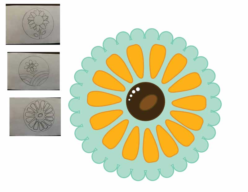
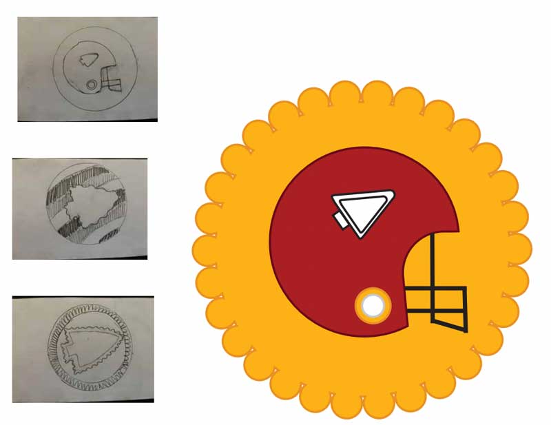
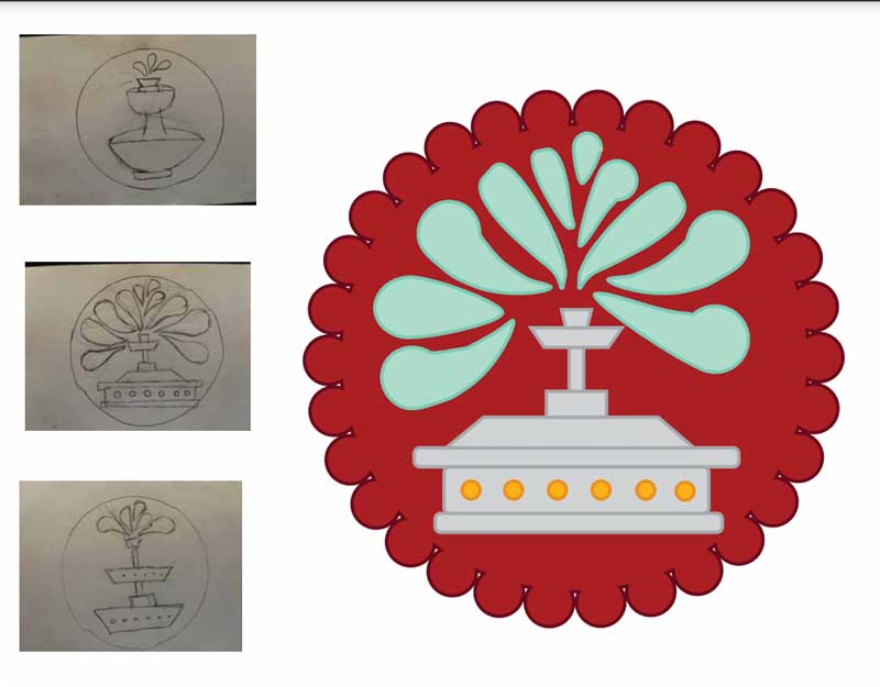
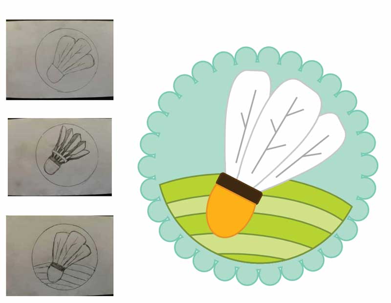
These are the three main colors I decided to use in my project. I chose yellow because Kansas is known as the Sunflower state. You can always find those smiling yellow flowers in the summer and fall. Additionally, there is a famous art museum in Kansas City that has GIANT badmintons scattered across the front yard. Besides their giant size, what distinguishes these badmintons the most is their bright yellow/orange colored tip. Then, I chose red to have a darker color and create contrast. Red and yellow are also the Kansas City Chiefs’ colors and are easily identifiable by any KC sports fan. Finally, I chose a seafoam blue color. Kansas City is known as the city of fountains and has the second most fountains in the world after Rome. I knew that a fountain was a design I wanted to incorporate, and I would need to use a blue color for the water. Additionally, yellow, red, and blue are the primary colors so I knew they would work well together. Kansas City is also an older city, rich in history. I wanted to create a retro vibe with deep colors, yet bright enough to represent the hustle and bustle of the city.
KANSAS CITY
TWO STATES, ONE CITY


Design Analysis
Target Audience Appeal: This design is girly, especially with the scalloped edge. Each icon portrays a Kansas City identifiable object. The sunflower is the Kansas state flower and is an icon that would only draw the attention of young girls. The colors are bright and fun, which draws the audience’s attention. The color scheme is strong and maintained throughout all four icons which creates visual appeal. I could see these sold as a sticker set in one of the many KC themed boutiques or spirit stores.
Main Design Decisions: I wanted the design to be fun, so I decided to not have any harsh edges unless necessary. For example, the mask portion of the helmet is straight with harsh angles and edges. I wanted the sunflower petals to be big and stand out with a bright yellow color! I decided to keep the large, rounded shape of the petals and use them as a base for creating the spewing water and feathers on the badminton. I also repeated the circle shape in all the designs e.g., in the middle of the sunflower, the details on the fountain, the semicircles that make up the grass on the badminton, and the large circular helmet. All these circles make the design look more cohesive and create unity. There is subtle detail in each design, but overall has a clean and simple look. Furthermore, to make a unified I added the same scalloped edge on all the icons. Lastly, I wanted each object (the flower, fountain, badminton, and helmet) to stand out and be bold. So, each object fills the majority of the white space on each icon, while still leaving sufficient white space for your eye to rest.

Principles of Design Analysis
Contrast
The biggest example of contrast is in the color. You have bright colors like the yellow the is contrasted with a darker red, or lighter blue. Also, the deep brown center of the flower is contrasted with the bright yellow all around it which makes it stand out. The strokes on each object are also darker, making the fill color pop. The second element of contrast is the minute details versus the large, rounded look of each object. For example: the fountain has small yellow circles which contrast against the large, rounded shape of the spewing water, the flower also has small little circles in the middle which contrast against the bigger circles already in the center, the badminton has small lines on the inside of each large feather, and the helmet has the smaller detail of the arrowhead inside the large, rounded helmet.
Repetition
There is lots of repetition in this design. There is repetition of the colors blue, red, and yellow. There is repetition of the large, rounded ends on the petals e.g., water, feathers, helmet, the small earpiece circles on the helmet, the shape of the green grass etc. The scalloped edge around each icon is also repeated. The flower petals are duplicated around the center and the water droplets are reflected and repeated on each side. The semicircular shape of the grass is replicated and has a repeated “every-other” green color pattern. Finally, every object and part of the design has a 3 pt. stroke around it.
Alignment
Since the main shape of each icon is a large circle, the objects are all centered in the middle. There is equal distance from each object to the scalloped edge. Most of the objects are connected or touching another shape, which lets the audience’s eye know that the various shapes all together create one completed design.
Proximity
I really like the proximity of the flower petals and the water. They are not attached together at a single point. Instead, they are equally spaced out and reflected around a central point. The spacing in-between the center point and the petals/the water are all the same. For example, in the flower the petals are all equal distance from the middle of the flower, but they are still close enough together that you can tell the oval shape of the petals and the round center are related. They are meant to be seen as one cohesive object —> a sunflower!
Color
There is a lot of color in these icons! I wanted the colors to be bright, while maintaining good contrast. I decided to fill in the strokes with color so that it would pop (aka be more contrasted). Each stroke is also just a shade or two darker than the fill color. Yellow, red, and blue are all primary colors and work well together. Then there are small hints of white, black, or deep brown that help balance out the bright colors.
0 Comments