Blog page -wide
Style Guide: Rosehill Blooms
Style Guide: Rosehill Blooms
After rebranding Rosehill Blooms, I created a style guide for the Instagram Page. A style guide is very important for establishing consistency; not to mention it will help you create content faster and confidently! This style guide was created in InDesign.


A Fresh Instagram Look: Poppy Teeth Whitening
A Fresh Instagram Look: Poppy Teeth Whitening
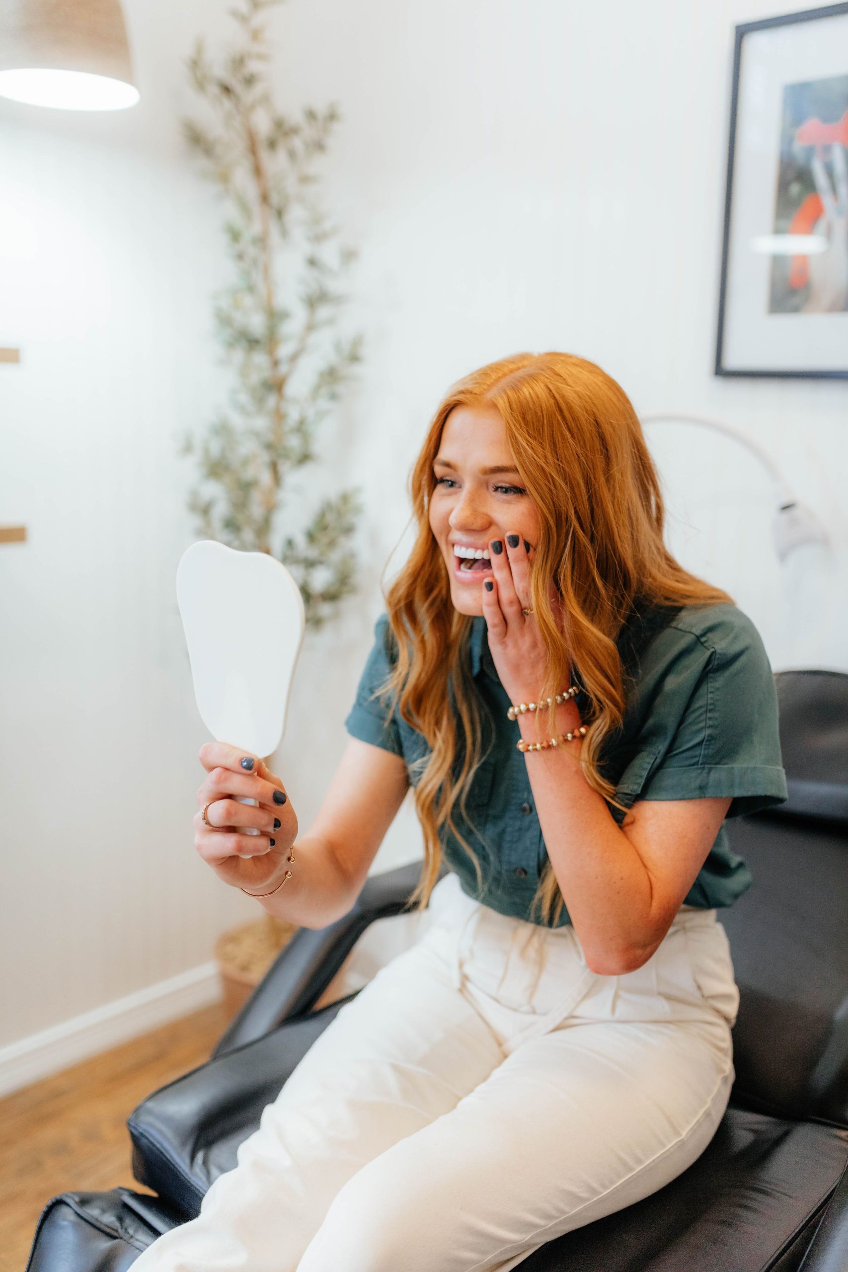
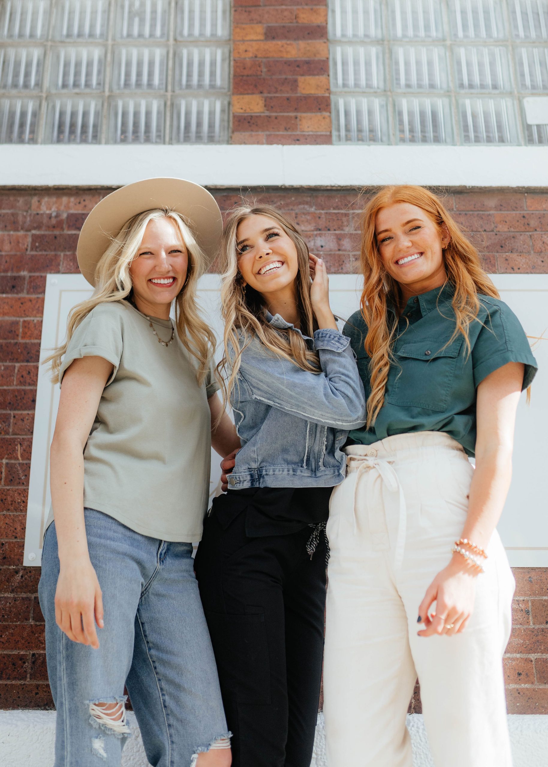
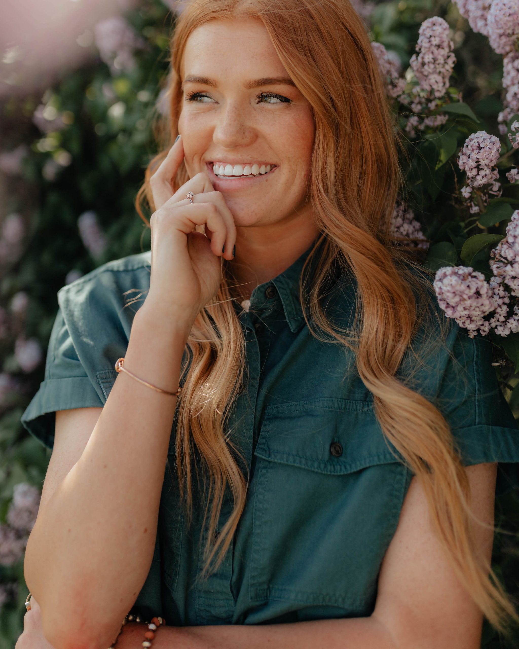
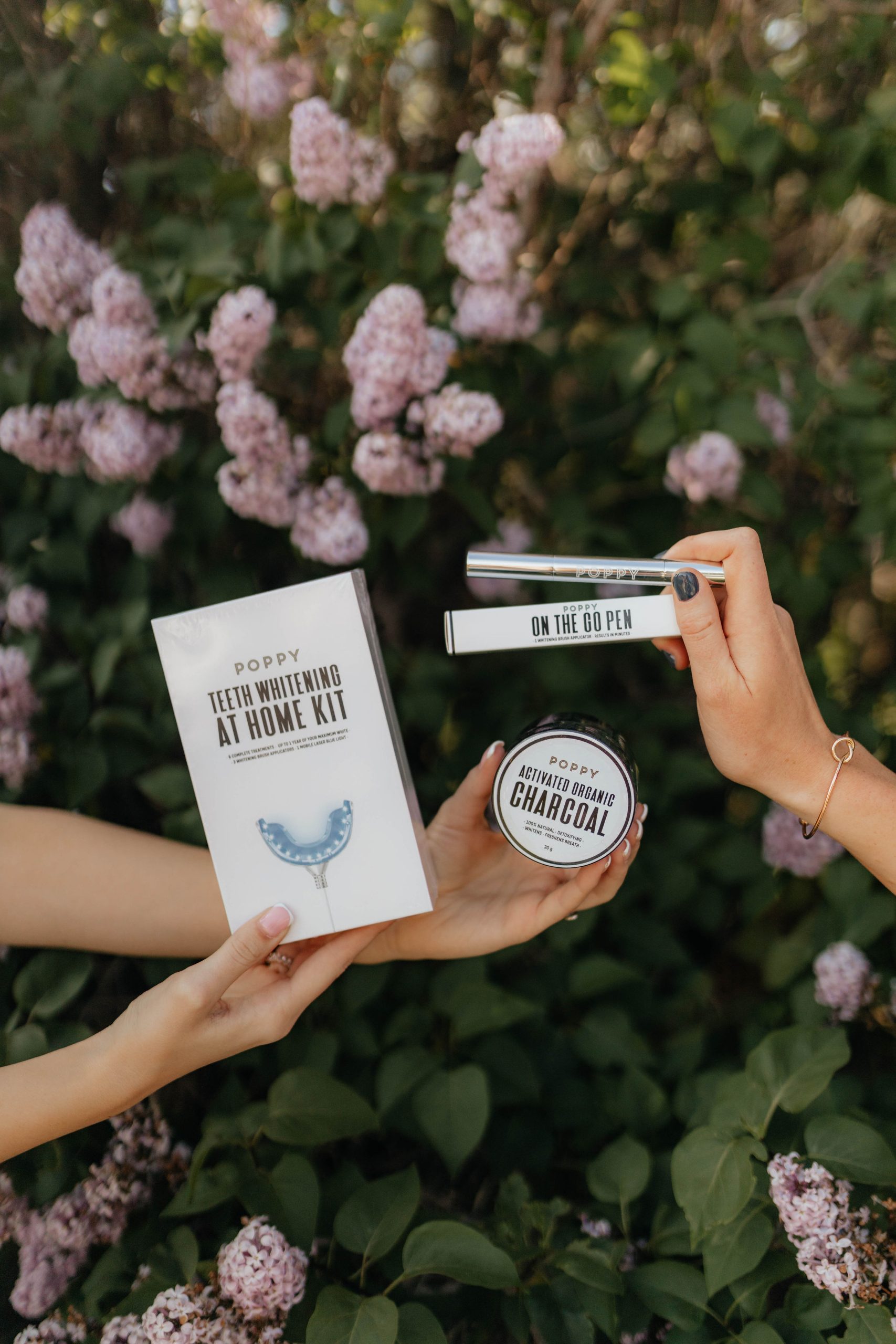
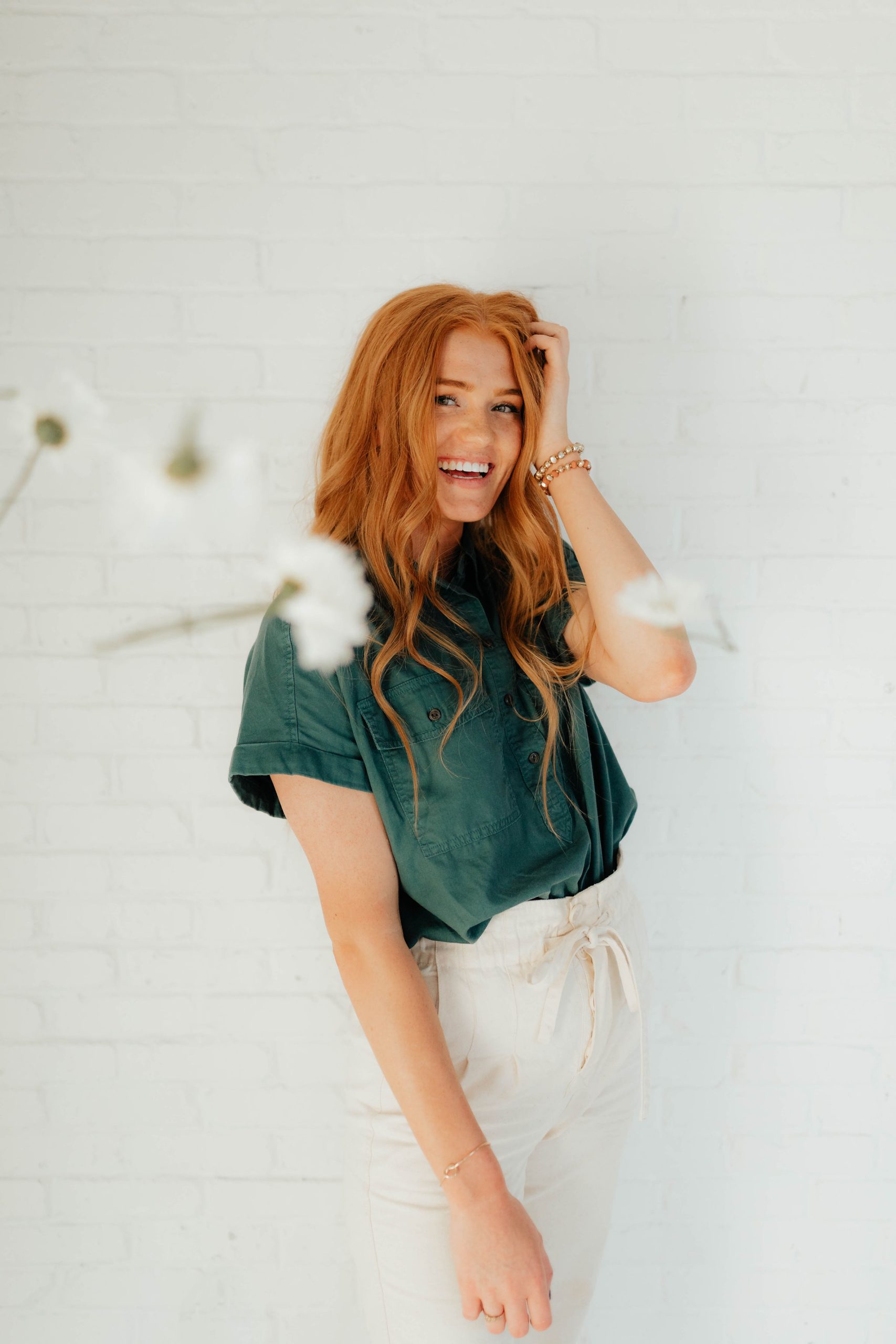
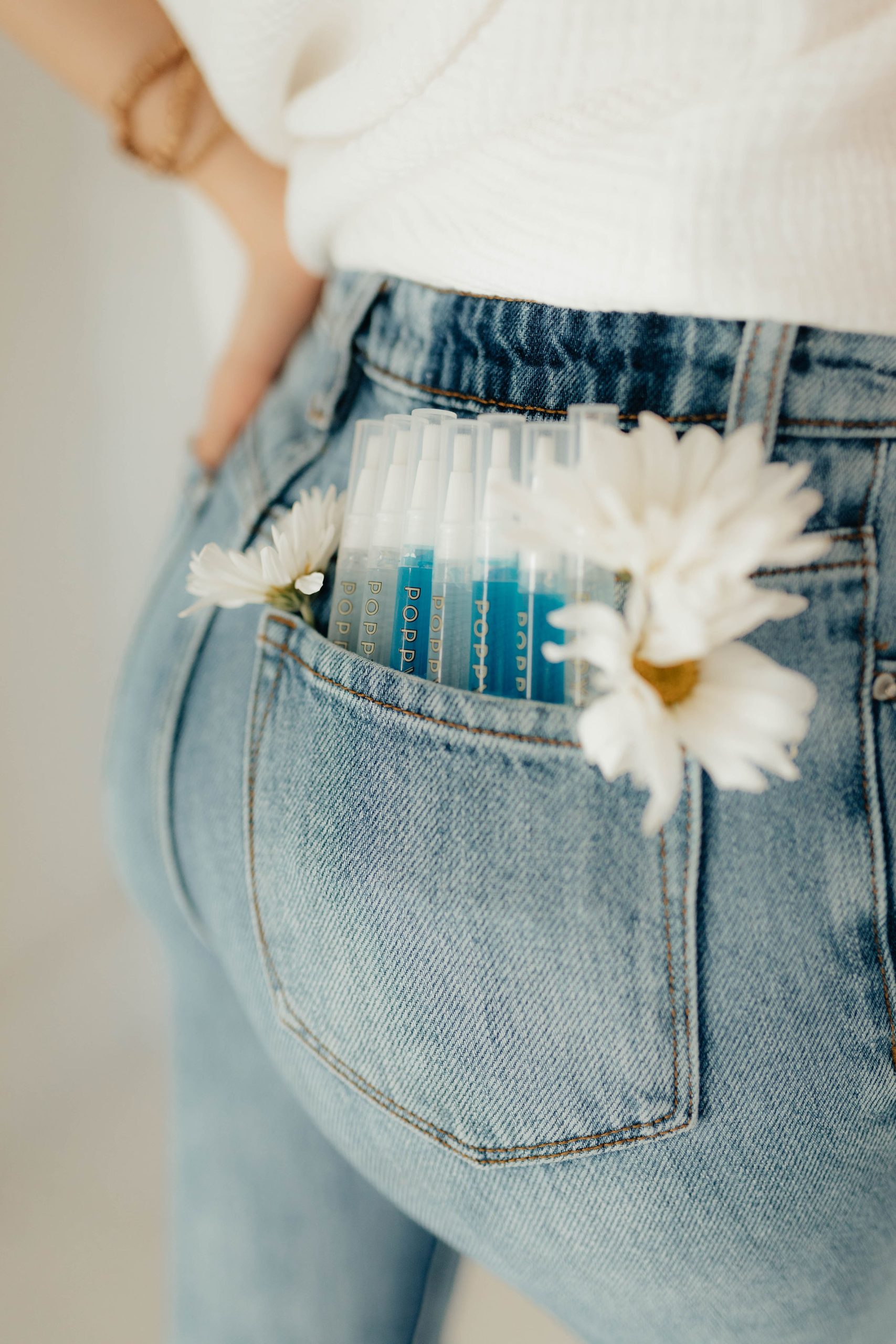
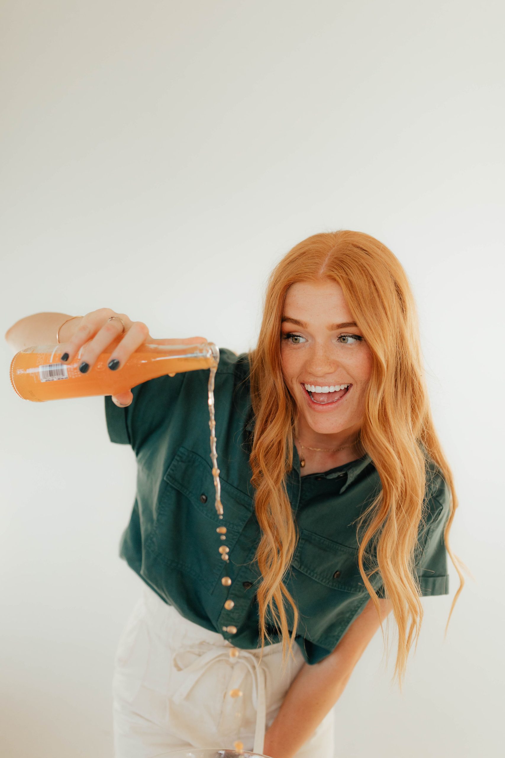
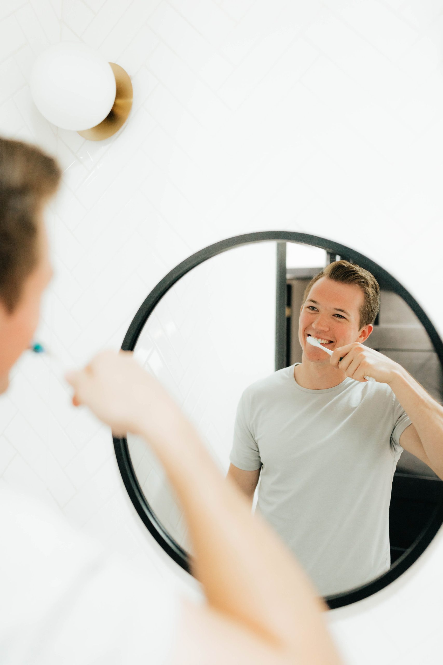
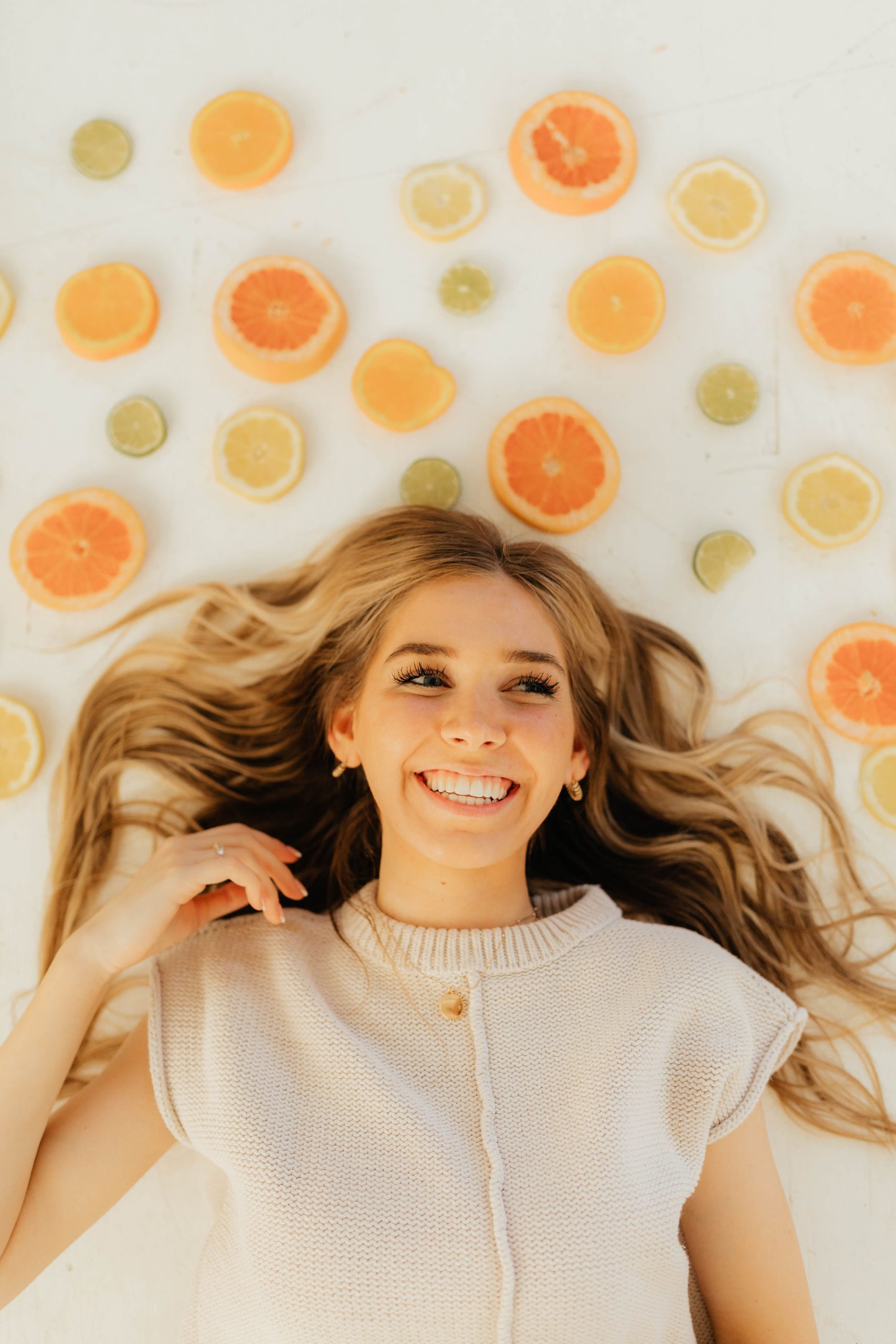
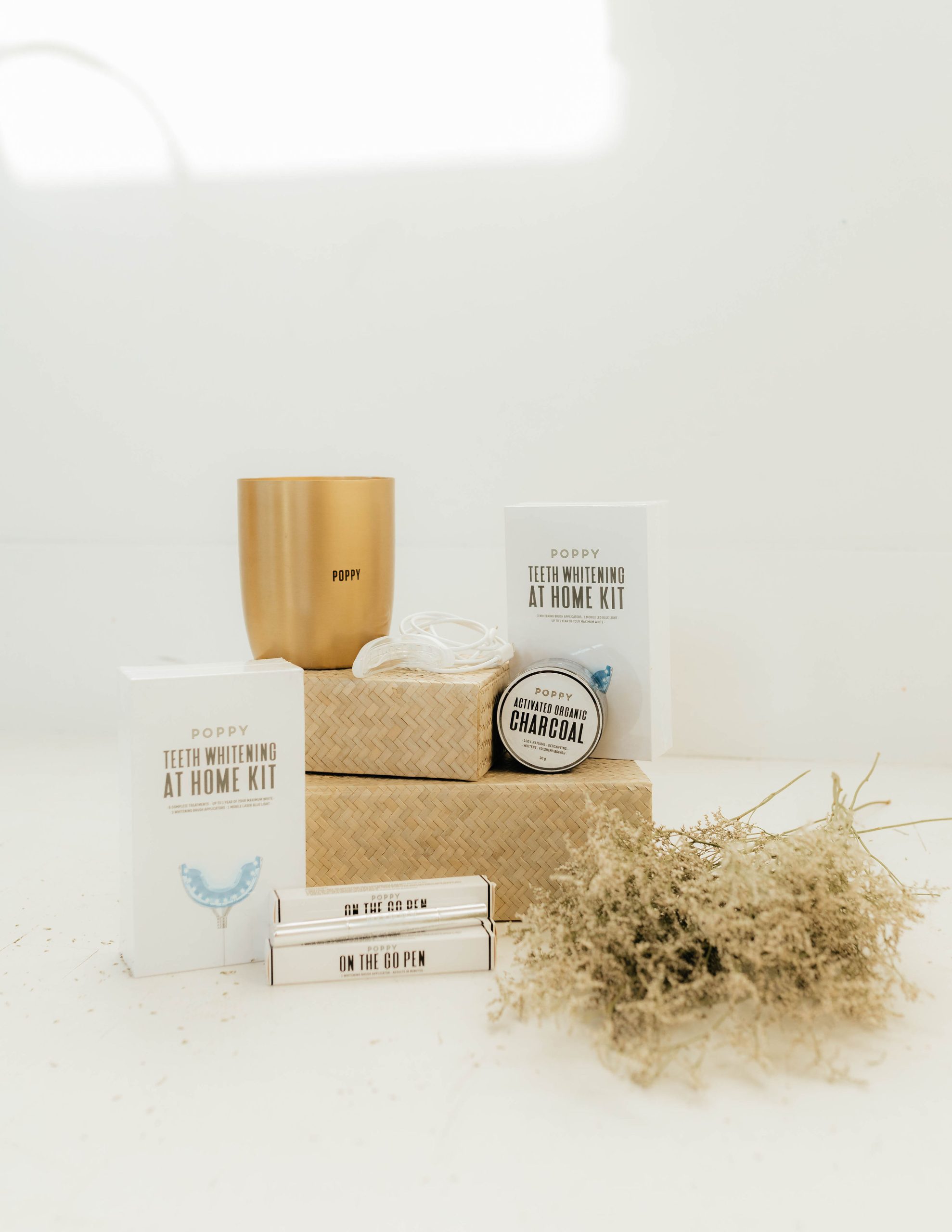
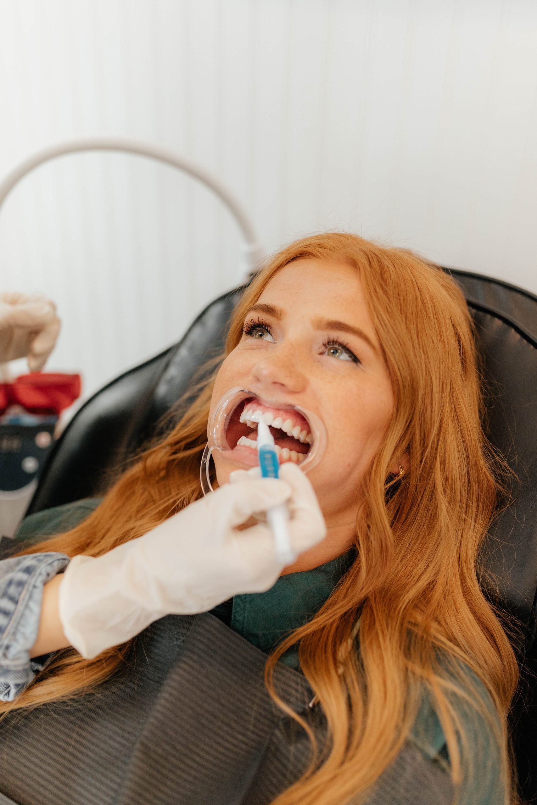
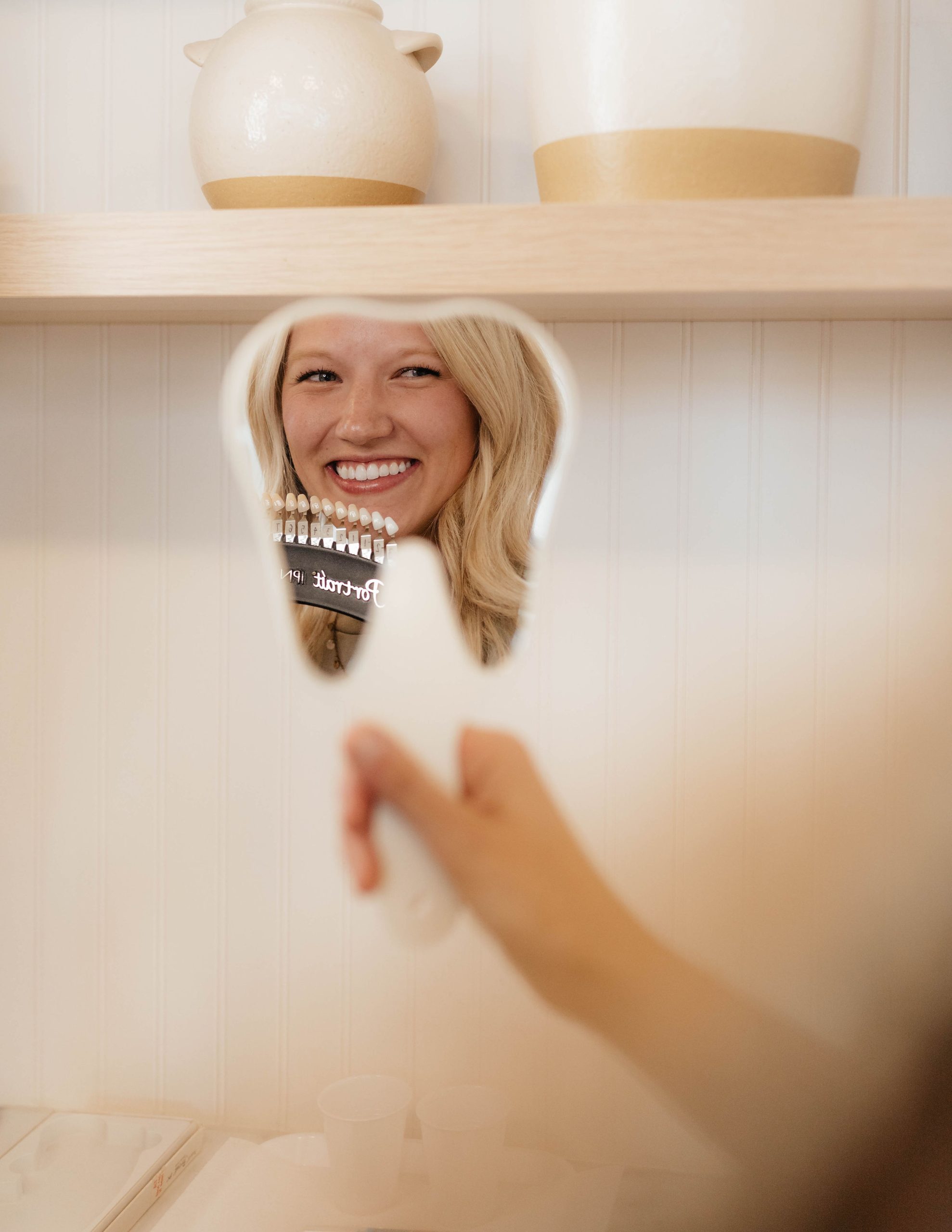
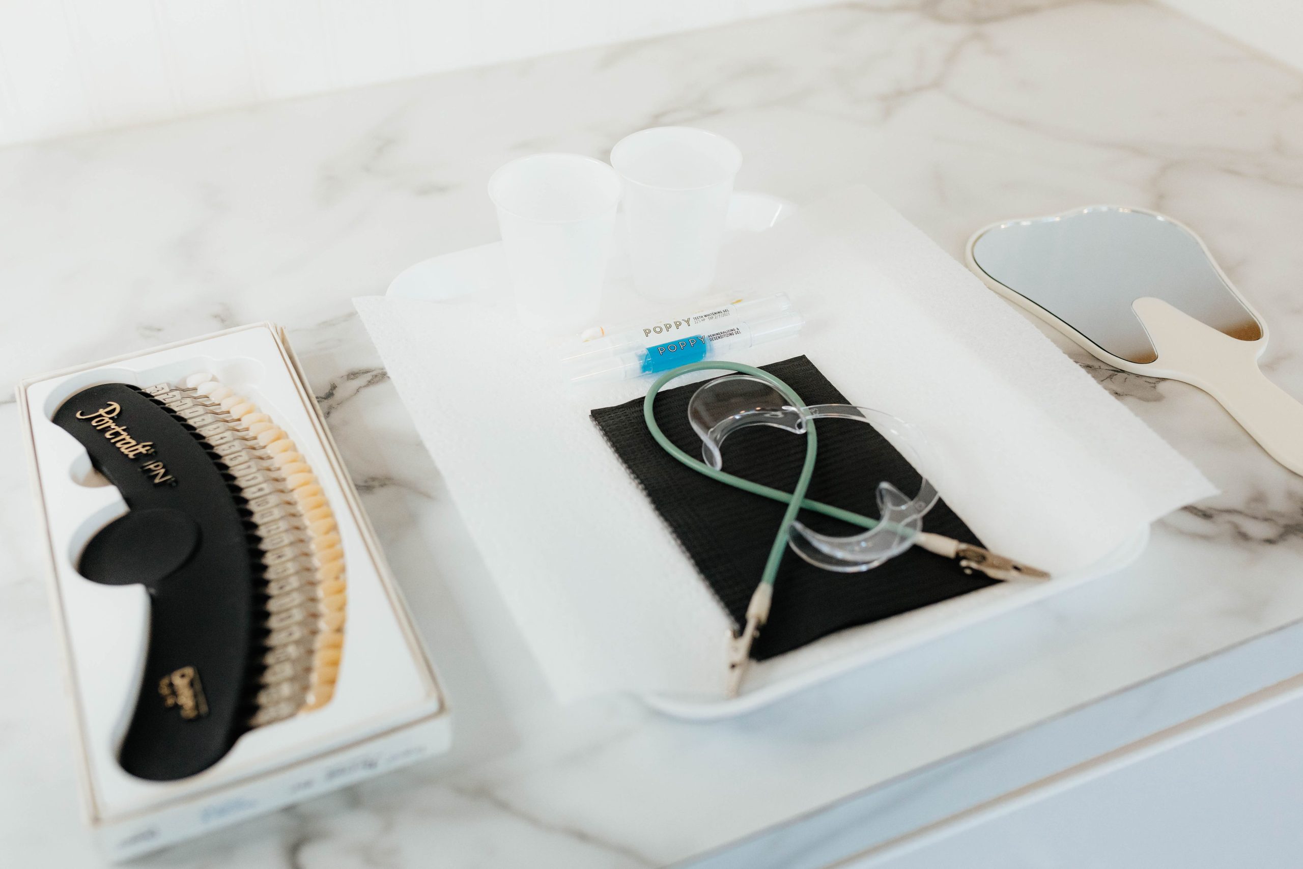
Poppy Teeth Whitening needed new, fresh, and engaging content for our Instagram page and for the development of a new website. My boss and owner of Poppy Teeth Whitening, Chloe Royce, and I decided to plan a photoshoot. The images from this shoot would be converted to content for the summer months (June-September), product shots for the website, and images of the training material to update the certification course.

Creative Content Ideas for Instagram:
My boss and I brainstormed catchy captions that could then be turned into prop/photo ideas. There was no idea too big or too small. I absolutely loved this process! Thinking creatively and planning out our content 3 months in advance is any content creator’s version of fun! Here are a few of the ideas we came up with:
- Old Fashioned Phone… “We’re calling your name”
- Headphones.. During appointment you can relax .. music “my jam”
- Old Fashioned cups, sodas, cute straws.. Drink through a straw to help keep your teeth white.. Drinks to avoid
- DRINKS- “cheers to the weekend! Cheers to you, cheers to 2 years/new year! etc)”
- Donuts- “Do-Nut forget to book your 6 month touch up!” “Do-Nut mess around with these products, because they are just that sweet”
- TIME- Clocks set your alarms (great for a launch, giveaway, or reminder)
- “Leap of faith.. Leap into new confidence..” Pose where smiling mid jump
- REMINDER on phone- time to come in for your 6 month touch up
- Hats off to you.. Throwing hat at camera, hat covering face but smile
- Main Squeeze with Citrus.. Lemons and oranges
- Lollipops- Detail shots of smiles.. “I’m a sucker for white teeth”
- Holding camera over half of face and smiling – “Get your smile picture perfect”
- Peace sign towards camera “Peace out winter, peace out yellow teeth”
- Shot of just smile and jewelry/collarbone- “a smile is our favorite accessory”
- Book in hand- “My books are open for July! BOOK today”
- Whispering into a friend’s ear with a friend smiling.. “Talk about the … I’ve got a secret for you.. Turn on your notifications for our big secret coming on ___”
Photo Inspo: We also compiled a lot of photo inspiration for the photographer and models to review.


We also made a list of all the photos we needed for the website and training manual. After I complied and organized the long list of ideas into a detailed shot list, grouped by location. For this shoot, we were going to three locations in three hours. First, we would start at the teeth whitening studio, then we took a short drive to a beautiful garden, and last we went to the White Space Photography Studio. Additionally, I did photographer research. Eventually, I found Autumn Film & Photo. She was experienced, fit the style of our company, and had a reasonable price. Props were ordered, gathered, and prepared. Additionally, a clothing and grooming style guide was sent out to all the models.
Photoshoot Day!
Photoshoot day arrived and I was so excited! My boss and I worked together to plan the day so everything would run smoothly. However, during the photoshoot we started to fall behind schedule, and I could tell she was feeling a bit overwhelmed. I stepped in and directed the rest of the photoshoot. I reviewed what photos we needed to get and directed the models to where they needed to go. I set up stations with each model. Then the photographer moved from station to station, capturing the photo and continued on. This greatly improved the flow of the shoot and helped us to catch up with time. By the end of the night, I ensured that all our plans were accomplished! My boss was extremely grateful for my help and leadership responsibility I assumed. The photos turned out so good and are a wonderful addition to our Instagram feed, training manual and website.
Results!!
Idaho Falls Bridal Fair
Idaho Falls Bridal Fair
To create more brand awareness and target our audience, I helped take Poppy Teeth Whitening to the Idaho Falls Bridal Fair. I helped coordinate the event, set-up, and engage with potential clients. We offered a special teeth whitening discount for any soon-to-be brides and grooms. The event was a success! Here is a small video of that day.
Strive To Be
Strive To Be
Strive to Be is the official youth Instagram page for The Church of Jesus Christ of Latter-day Saints. Their Instagram page is bold and bright! The font is a simple Sans Serif font. The photos feature youth of all ages, races, cultures, and economic status. The page features radiant youth who live the gospel of Jesus Christ in normal and natural ways. The testimonies and experiences of these youth inspire, uplift, and change lives all around the world. Here are a few pieces of content I made to fit their Instagram page.

Caption: After watching general conference, I’m going to make time for the Lord everyday so I can draw closer to him. One of the ways I’m going to make time for Him is by reading the Book of Mormon with my family. —Grace

Caption: I’m excited for the new For the Strength of Youth pamphlet because I know it’s counsel comes directly from God for us. I’m excited to see all that He has in store for me! —Grace
Social Media Specialist @Poppyteethwhitening
Social Media Specialist @Poppyteethwhitening
I first got involved with Poppy Teeth Whitening in January 2022. For my communications writing class, I was asked to write a local feature story. I thought of a cute local Teeth Whitening business in Rexburg, Idaho. They had been open for about two years. I reached out to the owners Chloe and Chance Royce and asked permission to make their business the focus of my feature story. They glady accepted and interviews were set a week later. (Click here to read the feature article, A Professional in Smile Design.)
Meeting them was such a delight. It was great getting to hear their story. A couple of days after the interview, Chloe reached out to me with a job offer to help with a few office errands and help run their Instagram account. (Text message on the right.)
I was so flattered and excited about the opportunity! A few days later we met to discuss this exciting job opportunity. During our conversation, rather than be an office assistant, it was decided that I would be hired as a social media & events specialist.

My job duties included:
– Develop social media strategies through coordinating content design, writing, scheduling posts, and ensuring content is engaging and resonates with the targeted audience. Collaborate with boss Chloe Royce in content creation.
– Maintain specific brand voice, tone, and aesthetic.
– Research and stay informed on current social media trends.
– Post weekly on Instagram and maintain an active and engaging story.
– Grow followers, engage, and retain them, and help convert them into clients of Poppy Teeth Whitening.
– Other goals include decreasing response time for direct messages and creating an inviting community
– Coordinate, plan and participate in community events to increase marketing
Instagram Page @poppyteethwhitening
Instagram Page: @poppyteethwhitening


Instagram Stories


Self Evaluation
I loved being in this fast-paced, friendly environment! I learned so much in time working with them! I absolutely loved every aspect of working at Poppy Teeth Whitening!
ATTITUDE
From day one I came in eager and ready to work! Before I began working there, I silently observed the Poppy Teeth Whitening Instagram page to get to know the brand. Even though I was unfamiliar with some of the assigned tasks, I jumped right in. If I did not understand something I made sure to ask questions and carefully observe my supervisor. I looked forward to working with them every day.
PROACTIVITY
I was always very productive during my shifts. I looked for things that needed to be done and did them. For example, we were preparing for an upcoming photoshoot to get more social media content. I voluntarily took the responsibility of organizing a shot list, a props list, and then finding the props at the best price to send to my boss before purchasing them. I was always very organized and immediately put all my meetings and important business dates into my personal calendar. I was also able to lighten other’s workload by quickly responding to the DMs on their social media channels. After a few weeks I had gained enough knowledge and was able to answer more tough questions and concerns that arose from clients and leads, therefore alleviating others’ workload.
CREATIVITY/PROBLEM SOLVING
I never wanted my work to simply be a check-the-box item. I always try to put my heart into my work and see how said task could benefit me in the future. When my boss and I were planning or problem solving, I was quick to offer solutions and a new way of looking at things. When we couldn’t decide how to word something or respond in a situation, I offered my perspective as a consumer. When we had to plan giveaways and create new content I brainstormed and sought inspiration through a variety of sources. Outside of work time, I brainstormed lists of content ideas and examples to resolve the audience’s pain points.
COMMITMENT
I was never late to work and always stayed the entire time. If I still had more work to do, I would stay longer or complete the work at home after hours. If for some reason I was going to be late or had a conflicting event, such as a doctor’s appointment or meeting with a teacher, I informed my supervisor beforehand. During my shift, I was always on task and made sure to silence my phone from all notification to stay focused. There were a few days that my supervisor was gone for a family funeral. During that time, I arrived to work on time and was entrusted with taking over all the tasks while she was out.
INTERPERSONAL COMMUNICATION
Many times, my boss, Chloe, commented on my cheerful and positive attitude even in stressful or busy circumstances. She has commented on what a pleasure I am to be around. I work well with my coworkers and took time to get to know them individually. I did not engage in office gossip, politics, or drama and neither did any of my coworkers. I really appreciate the professional and friendly work environment at Poppy Teeth Whitening! If I was unsure about how to do something I asked for clarification. For example, I had a large part in planning multiple social media giveaways & collaborations. However, I didn’t have any previous experience doing either of those things. Instead of guessing, I asked questions, sought directions, and asked for feedback on my work. I now feel confident I could plan another giveaway on my own.
LEARNING/LEADERSHIP
One example of where I was able to appropriately demonstrate leadership responsibility was during a brand photoshoot. My boss and I worked together to plan the day so everything would run smoothly. However, during the photoshoot we started to fall behind schedule, and I could tell she was feeling a bit overwhelmed. I stepped in and directed the rest of the photoshoot. I reviewed what photos we needed to get and directed the models to where they needed to go. I set up stations to help with the flow of the shoot. This also greatly helped us to catch up with time. By the end of the night, I ensured that all our plans were accomplished, and my supervisor was extremely grateful for my help and leadership responsibility I assumed.
NETWORKING
I have definitely built appropriate office friendships and connections with my co-workers and supervisors. I know that we will be able to maintain contact with one another and support one another as we continue to move forward. My bosses asked me to keep working with them virtually over the summer while I am home. I am grateful for the relationships and connections that have been made.
WRITTEN COMMUNICATION
Yes, I worked hard to make sure I was both professional, concise, and communicated accurate information when responding to messages and emails. I created prewritten responses to frequently asked questions and then edited them on a case-by-case basis. I always reread my messages to check for grammar and spelling errors. Early in the internship, my boss Chloe said she felt confident with me responding to messages because we have a similar “voice” in texting/emailing and I can problem solve quicky.
TRUST
I was highly organized and always trusted. There were a few times I was told to clock in after work hours from home. That’s because they trusted me to use my time wisely, effectively and be honest. I am grateful for the amount of trust my bosses have in me. I was very organized in my notetaking, content planning, and put everything on a calendar. I never missed a deadline and kept back-up copies of everything!
EMPLOYABILITY
I am confident that Chloe and Chance would recommend me to another hiring manager. The feedback she has given me based on my performance has always been positive. I know she trusts me and appreciates my hardworking, positive attitude in the workplace. Chloe has told me let her know if there is ever anything that she can do for me! I am positive that she would be happy to help in any way!


Goodnight, Moon
Goodnight, Moon
For this project my goal was to learn the basics of After Effects to create a cute, playful animation. I wanted the animation to be short, so that I could focus on quality versus length. I watched a variety of cartoons, and I was inspired to make a playful, child-like animation depicting a sunset and night sky. I envisioned each color of the sunset rising one by one. Then, the sunset would disappear behind the mountain range and a sparkling night sky would rise. More than anything I wanted people to smile and feel happy when they watch my animation!
Programs Used: Adobe llustrator and After Effects

Scribble Time!
")
With those thoughts in mind, I began sketching my design. During the sketching process, I thought about what pieces of the illustration would need to move independently. I drew out all the pieces individually and made a storyboard for the animation. I wanted to highlight every detail of the illustration, so I decided to have each element pop up individually.
After I had a promising idea of what I wanted my final animation to look like I began designing. First, I created the graphics in Illustrator, ensuring each moving element was placed in its own layer. Next, I imported the Illustrator file into After Effects. Before animating I took the time to learn the program. I watched lots of videos, talked with my professors, and took lots of notes. Eventually, I felt confident enough to begin the animation.
Rough Draft
Advice & Application
Ta-da!!! Final Animation
")
I love the way the finished animation turned out! The idea in my head really came to life! I think the simplicity of the design, the colors and the music all work together to create a happy and playful animation. I could definitely see something like this in a children’s cartoon. I also learned the basics of After Effects and I am confident that I could recreate this design in about a third of the time. I am excited to learning this program. I showed my final animation to multiple people and their reaction upon watching it was, “aw that’s cute!” Mission accomplished!!
The Band Navie – Gig Poster
The Band Navie – Gig Poster
I was tasked to create a gig poster for the imaginary band “Navie.” They are a girl band that writes country love songs. My goal for the poster was that the audience would immediately recognize that the poster is promoting a country band. My second objective for this poster is that it reflects a feeling of love and happiness. To accomplish this goal, I knew I wanted the colors to be warm toned and consist of primarily pinks, red, and oranges to represent love and happiness. When I thought about this band I imagined open plains, flower fields, and simple beauty. I thought about a cowgirl and the plaid shirt she might wear. I took all these ideas and combined them together as my inspiration.
To the Drawing Board!


Feedback & Improvement


Drumroll Please… The Final Result!

Watch Out For Fakes!
Watch Out For Fakes!
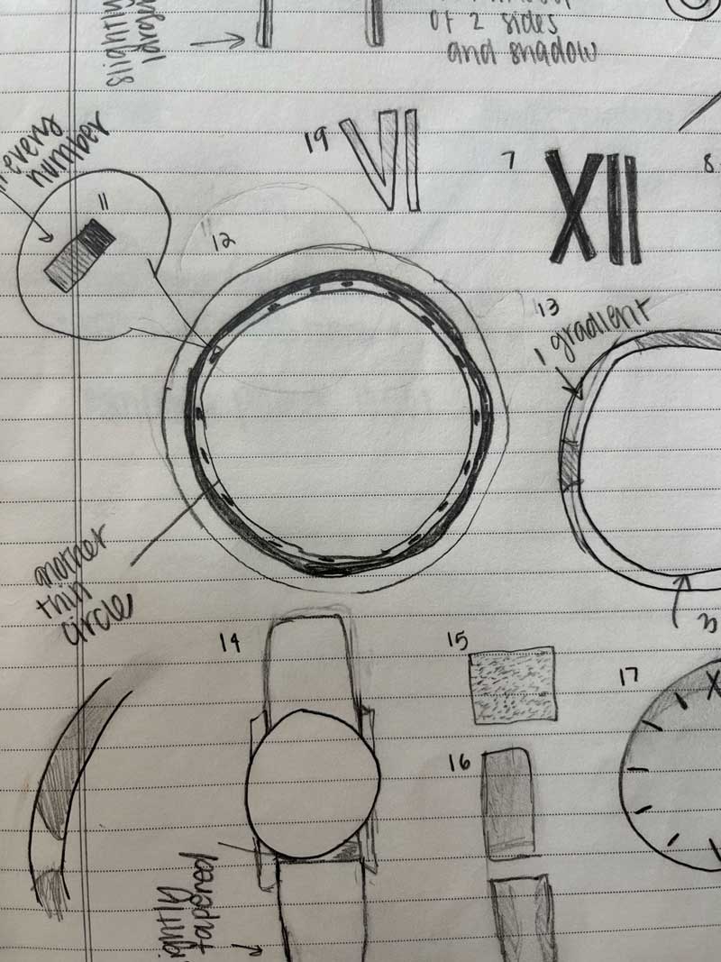
For this project my goal was to make a photorealistic looking watch using only vector graphics. This task seemed daunting at first, almost impossible I might add. But after about 40 hours of work in Illustrator, I am happy with my results. To begin, I used this beautiful Vincero watch as my inspiration! I loved how simple it was yet elegant. My objective in creating this watch was to maintain its classy and luxurious appearance. The difficult part of creating a watch is that it has many reflections, highlights, and shadows. While doing this project I hoped to gain a better understanding of the tools available in Illustrator and how to create a realistic graphic.

To the Sketch Book!
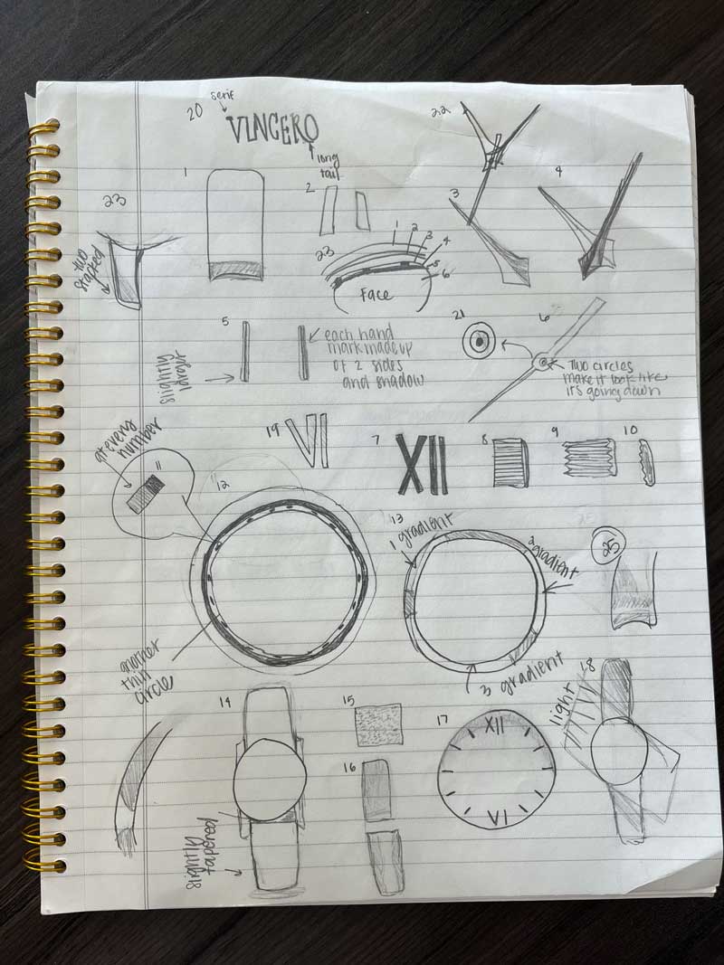
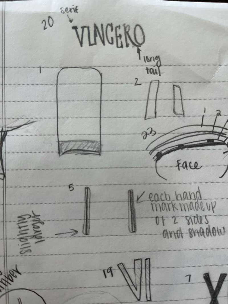
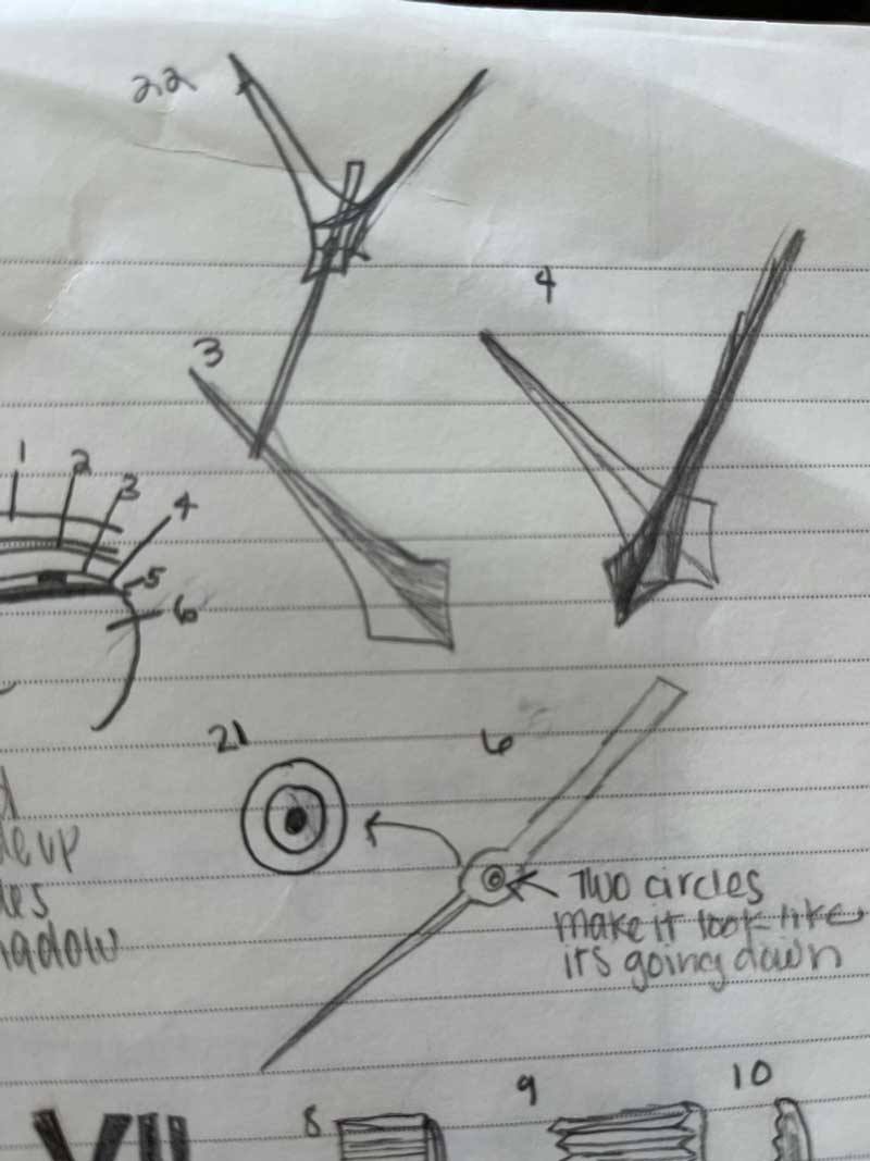
A Watch is Born

In the first drafting stage focused on using basic shapes to create the structure of the watch. I also was careful about using rulers and guides to ensure that everything in the watch was symmetrical. The rotate and reflect tools proved to be extremely helpful in this process. I also found a font that was similar to the brand Vincero. I did the roman numeral styles letters on my own using rectangles. I was very pleased with how my watch was coming together after the first draft.
Time is Ticking: Improvement


Application
I tried my best to color match the knob from the watch photo and then added a gradient above it. This little knob took me a long time to do. It was difficult to add multiple different gradients on top of lots of little, tiny pieces. However, after reaching out to a few peers for help I was able to accomplish my goal.


Final Product

After hours of work and fine editing this is my final result. I am happy with the way it turned out and think that it looks like a photorealistic watch. I focused on using warm, rich colors and using multiple layers and masks to give the watch a subtle but realistic metal look. I was able to add highlights or shadows in specific areas by using the draw inside tool. I gained a greater capacity to problem solve and feel more comfortable in Illustrator. I learned how to use tools such as masks, contrast, blurs, textures and gradients. I also really loved the texture I found and made the biggest difference in making it look photo realistic. There is obvious improvement from the first draft to the final and I am happy with the result. I cannot wait to continue expanding my Illustrator skills!
Summer in Idaho Set
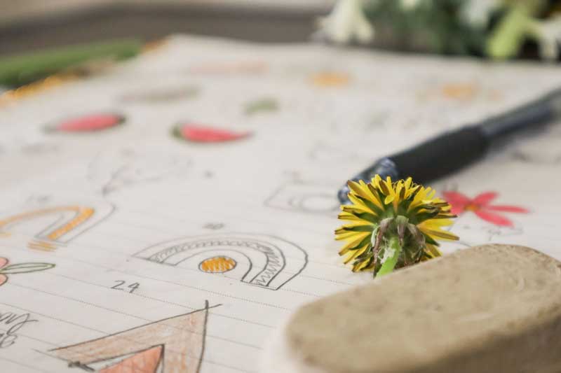
Summer in Idaho Set

When I think of a summer in Idaho one word comes to my mind- adventure! Because of Idaho’s large mountain range, national parks, and beautiful scenery I knew that many of my icons would encapsulate the outdoors in some way. I live in a small town in Idaho, where everyone is so calm, happy, and enjoys the simple life! Because of that I did not want to make the icons appear too complicated with lots of detail. My objective was to reflect happiness, simplicity and enjoyment of living in this great state. The process of creating these icons included sketching, designing, more sketching, peer feedback, and multiple rounds of revision. Let’s look at these steps in greater detail.
Program Used: Illustrator
Ideas & Sketching
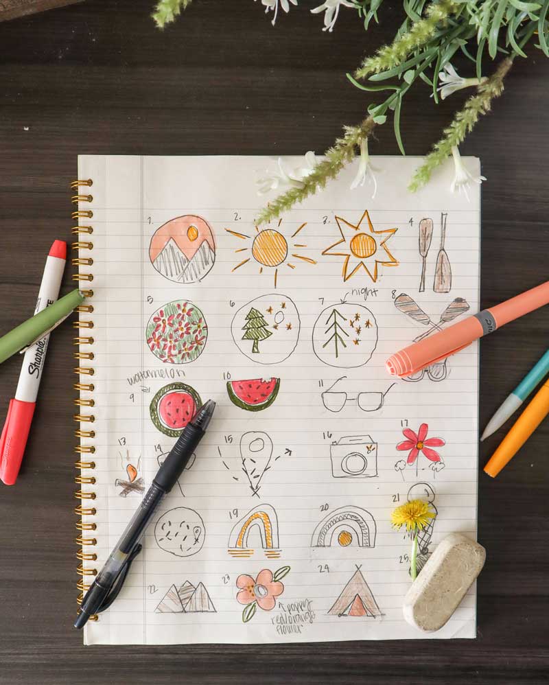
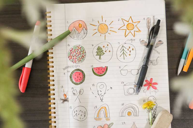
I began with a brainstorming session. I listed a bunch of ideas that came to my mind when I thought about the summer. Then I sketched out 25 different variations of my favorite ideas from the list. During sketching I tried not to overthink or be too complicated with my designs. I wanted them to be simple and easily recognizable. I also did not want any overly sharp edges. Summertime to me means a worry-free state of mind. I did not want these icons to feel tight or trapped in, so I tried to avoid any hard lines or corners in my design process.
A very rough draft


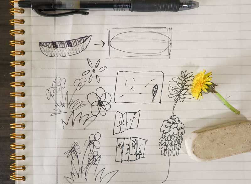
Feedback & more drafting
After the first draft I received some feedback which included: simplifying the bark, changing the toasted part of the marshmallow, working on how the handlebar attaches to the paddle, adding thicker strokes to the paddles and changing all the other strokes so that the darker color was on the outside. A lighter stroke on the outside, like on the mountains, gives off a glowy look and that is not what I wanted. So, after some more work this is what the second draft looked like:
This is Idaho
The Grand Tetons, St. Anthony Sand Dunes, Island Park
One icon that was especially hard for me to nail down was the roasted marshmellow. Here was my process:


The Final


Converse Ad Design
Converse Ad Design
This advertisement was a part of the 2012 converse ad campaign, “Shoes are boring. Wear sneakers.” The main purpose of this campaign is to persuade people that shoes are boring, common, and safe. However, sneakers are fun, outgoing, risky, and daring. Teens and young adults that are fun and cool wear sneakers! All the photos in this campaign ad depict converse wearers doing crazy, edgy things. The sneakers all have a worn, dirty look to them. These advertisements were created to target male and female teenagers and young adults. According to workingnotworking.com this campaign was run in over 70 countries and “led to the brand’s best sales numbers ever.”

Color

The original ad is very dark. Everything has a black shadow around it except for the Converse in the center. The main colors that stand out in this ad are red, blue, and white. The color, darkness, and grainy look to the photo give this advertisement a very retro aesthetic. Although red and blue are typically bright, bold colors they are muted in the original ad. The bright white text pops against the dark background and makes the headline stand out even more.
Typography

All of the text in the original ad is in the same font. It is a Sans Serif type face because it lacks the extra stokes at the ends of the letters and is monoweight. It is very straight, clean and modern. However, it also has elements of a decorative typeface as well. The font looks like paint or a marker. There are parts where the text is more opaque. It is a very style specific font. I think that this was a specific design choice that contributes to the rough, street-style look of this advertisement.
Design

The design principles of proximity & alignment work together in this advertisement. There are two large size lines in the center of the advertisement that make up the headline. These two lines are close together in proximity, meaning they have a relation to one another. And they do! The proximity of the two lines lets the reader know subconsciously that they are meant to be read together. The center alignment on this large set of text is bold and makes the text stand out. In contrast, the campaign title in the bottom right corner is small and does not align with the headline. The difference in size in combination with the difference in alignment signals that this information is less important. It does not stand out; rather it sinks into the background almost unnoticed. Furthermore, these two sections of text have a large proximity, meaning they are really far away from one another. This distance means the two sections are not correlated and should not be read together. The designer made the most important message (the headline) have the closest proximity, largest size, and gave it a center alignment to make it stand out and be the first thing that the audience reads.
New Ad Design- “Sneakers are Tough”

Color

This new ad I created is similar in color. This advertisement has a very rough look to it. The colors are not very vibrant and has an overall dark look to it. The brightest part of the advertisement is the Converse in the center. I tried to replicate that same thing. In the new ad the white, yet dirty, Converse are placed front and center to draw attention. The original ad contains three primary colors, red, blue, white, and then a darker background. The new image I chose also has many of these same colors contained within the various surrounding shoes. As you can see in the draw over the colors are not overly bright and is fairly simple.
Typography

I could not find the exact same font for the new advertisement, however I tried to find similar styles. In the new ad creation, I used two different typefaces for the headline. The first line is a Sans-Serif font that is tall and thin like the original. However, the original typeface looks like it was written with a thick marker. There appears to be little brush strokes and parts where the letters are opaquer. That is why I decided to use a decorative font for the second and third lines. Part of the text is opaque, and it has a much bolder, rough-tough look to it. I think this different font helps draw attention to the message that sneakers are tough and cool. Then, for the small campaign title in the bottom left corner I used the same Sans Serif font from the first line, that is like the original ad.
Design


I also mimicked these same design principles of alignment and proximity in the new design. Like the draw over photo of the original advertisement, this new one has the headline all close together. Even though there are two different typefaces, it is the proximity that lets the audience know that the three lines are related and read together. Then there is the same campaign slogan that is far way away from the rest of the text. This large proximity creates a separate thought/idea. Finally, like the previous advertisement there is the alignment. Like the blue lines depict, not only is the headline aligned in the center of advertisement, but the Converse in the background are directly placed in the center as well. The main subject in the original Converse ad are the sneakers. The sneakers are given extra attention by literally placing them front and center. The product is the most important thing in any advertisement, and the creators want to make sure it is the main focus of attention.
Summary
In conclusion, the original ad design and the new design could effectively be in the same campaign because of how the elements of color, typography, and design work together. Both advertisements have an old retro feeling to the photo. Each photo has a pair of converse placed in the center. The converse are the center of attention in the advertisement and the brightest part of the background. The rest of the surrounding background is much darker. Then, the text is written in similar style typeface as well. Both body copies send the audience the message that Converse sneakers are for cool people. Finally, the same design elements of alignment and proximity are also used in both advertisements.