YA Weekly Magazine Spread
One of my dreams is to work for The Church of Jesus Christ of Latter-day Saints. Their communications and media departments are world class. Everything that is produced is professional and has been crested with great care. I was thrilled with the idea of creating a magazine spread that could be found in the YA Weekly magazine. I found a great article on education that I decided to use for the copy.

Before beginning I determined the following:
Audience: My audience is young adults or college age students between the ages of 18-30. The magazine spread will be gender neutral to appeal to both sexes and will not be location specific. Although, it will not be specific to one location, it is for people who are primarily members of the church, so there will be a focus on church education systems.
Message: (What is the one thing I want to communicate to my audience through my design?) I want to convey to my audience that learning is an important commandment from the Lord.
Application used: Adobe InDesign
Photograph Attribution: Bailey Rindlisbacher
Article attribution: The Lord’s Charge to “Seek Learning” by Mindy Selu
Typography
Typeface #1 Name: Feltro
Typeface #1 Category: Decorative
Typeface #2 Name: New Order Light
Typeface #2 Category: Sans Serif
Typeface #3 Name: Museo Slab 300
Typeface #3 Category: Slab Serif
Color Scheme

I wanted to do brighter colors to grab people’s attention without being too overbearing. I really liked the blue and yellow/green color together. So, I took this palette and used lighter tints. I also wanted the colors to be clean and crisp. The yellowish color also is a stereo typical highlighter color that would help the reader identify that this is an article about education. The colors also complement each other well. Blue is a cooler toned color, while the yellow/greenish color is much brighter and warmer. Young adults are still fun so there is a need for color, but the magazine spread does not need as much color or as bright of colors compared to children for example. Lastly, I thought the colors were gender neutral and would appeal to both sexes.
1 Peter 2:9
“… You ‘are a chosen generation, foreordained by God to do a remarkable work—to help prepare the people of this world for the Second Coming of the Lord!”
Design Analysis
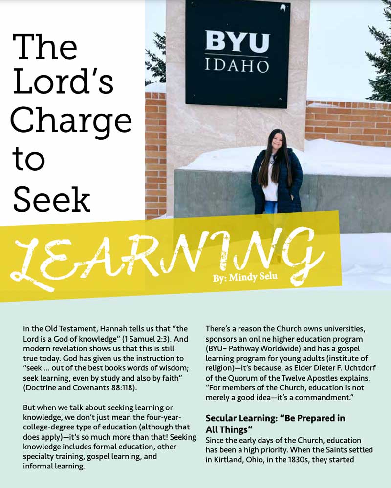
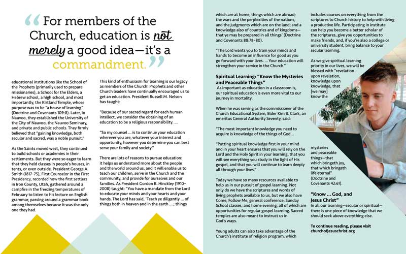
Target Audience Appeal: My target audience is young adults 18-30 who are members of the church. This design appeals to them because it shows the photos feature people within that age range, which makes it more relatable. The colors are also bright and grab the audience’s attention. Young adults also aren’t super serious, so instead of using circles I incorporated more fun, abstract shapes like triangles. These shapes also give the article a slightly edgy, which appeals to a younger audience. The series of triangles on the second page also combine to form mountains, which represents adventure and a thrill that young people are often looking for. Furthermore, the church owned-schools like BYU Provo, BYU-Idaho and BYU Hawaii are surrounded by the mountains and the students often go there on the weekends to get away. So, if you are a student that goes there the mountains are symbolic of the school and feel familiar.
Main Design Decisions: One of the first design choices I made was to highlight the article was about learning. I wanted that to be very clear. So, I made the word ‘learning’ in the title much bigger than the rest of the title. I also wanted the word to look like it was written out with chalk, so I used a decorative font. I also put a yellow block behind it to make it stand out and look like a highlight stroke. I did not want to leave too much white colored space, so I added a blue block underneath the text on the first page. Then I continued to incorporate blue and yellow colors on each page. To create contrast and make the magazine spread visually interesting, each page layout is different. Some pages have quotes, some have pictures, and some have triangles or rectangles. However, the design principles, color, and typography work together to create unity throughout the spread.
Principles of Design Analysis
Contrast
One of the examples of contrast is typography! The serifs in the title stand out against the body font which has no serifs. Then, the decorative font is vastly different from them both. The blue and yellow blocks/triangles contrast against the white color. There is a large contrast on the third page where the wrapped text around the photo contrasts against the normal, rectangular shaped body text. The pull quote also exemplifies the principle of contrast. Parts of the quote are a different color or font. This adds contrasts and adds emphasis to the important parts of the quote. The subheadings are also contrasted from the rest of the body by making them bold.
Repetition
There are many repeated elements in this design. The typography is repeated throughout the design. The same fonts are used in the title and pull quotes, while the body text is typed in another style font. The subheadings also have a repeated bold effect. Last there is repetition of triangles and the colors yellow and blue on each page.
Alignment
Since the picture on the front page is on the right side, the title has a left alignment. The body text is divided into two columns and with a right alignment. On the second page, the mountains and the pull quote span the top and bottom of the page. They are aligned with one another in the center. The triangle on the third page is centered on the right side of the page. The tip of the triangle aligns with the second column.
Proximity
On the front page, the first part of the title is close to the word ‘learning’ so the viewer knows that they are related and that it is meant to be read as part of the title. Furthermore, there is a return space between each new subsection. This separation lets the reader know that there is a change in the topic. However, there is no return space between the subheading and the new subsection. That allows the reader to connect the subheading title to the new paragraph of body text. Another example of proximity is the three triangles at the bottom of the second page. These shapes all overlap a little bit, which tells our brain to see the shapes as one connected design. Therefore, rather than seeing three separate triangles, our eyes recognize them as a mountain range.
Color
I wanted to use brighter colors in this article to make it stand out. The yellow is much more vivid, whereas the blue is a lighter tint. The yellow, white, and blue add a very crip and clean look to the design. These colors complement each other well, because blue is a cooler toned color, while yellow is much brighter and warmer toned.
Typography
I used three different fonts in this design. I used a large decorative font for part of the title to make the word ‘learning’ stand out. Then, I used a slab serif font for the rest of the title. The serifs add a typewriter look that is often related to school or scholarly works. The fonts in the title are contrasted with a very simple San Serifs font in the body. The simplicity of the body text draws the viewer’s attention to the title and the pull quote.

0 Comments