Create & Design
Strive to Be Graphic Design
During my internship I had the chance to design various stories, YouTube covers, and edit a couple of images. All of these designs were used on the Strive to Be Instagram, Youtube channel, and Gospel Living app. I used InDesign, Photoshop, and Illustrator. Here is a...
Style Guide: Rosehill Blooms
After rebranding Rosehill Blooms, I created a style guide for the Instagram Page. A style guide is very important for establishing consistency; not to mention it will help you create content faster and confidently! This style guide was created in InDesign.
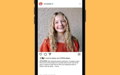
Strive To Be
Strive to Be is the official youth Instagram page for The Church of Jesus Christ of Latter-day Saints. Their Instagram page is bold and bright! The font is a simple Sans Serif font. The photos feature youth of all ages, races, cultures, and economic status. The page...
Goodnight, Moon
For this project my goal was to learn the basics of After Effects to create a cute, playful animation. I wanted the animation to be short, so that I could focus on quality versus length. I watched a variety of cartoons, and I was inspired to make a playful, child-like...
The Band Navie – Gig Poster
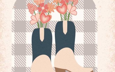
I was tasked to create a gig poster for the imaginary band “Navie.” They are a girl band that writes country love songs. My goal for the poster was that the audience would immediately recognize that the poster is promoting a country band. My second objective for this...
Watch Out For Fakes!
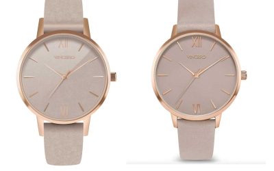
For this project my goal was to make a photorealistic looking watch using only vector graphics. This task seemed daunting at first, almost impossible I might add. But after about 40 hours of work in Illustrator, I am happy with my results. To begin, I used this...
Summer in Idaho Set
I was tasked with creating a series of 12 related icons that reflect something about myself. The inspiration for this icon set came after living through three consecutive winters. Anyone who knows me, knows that I love warm weather! After months of cold, snowy, and...
Converse Ad Design
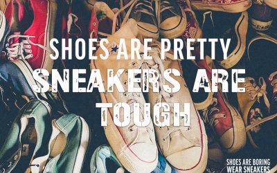
This advertisement was a part of the 2012 converse ad campaign, “Shoes are boring. Wear sneakers.” The main purpose of this campaign is to persuade people that shoes are boring, common, and safe. However, sneakers are fun, outgoing, risky, and daring. Teens and young...
YA Weekly Magazine Spread
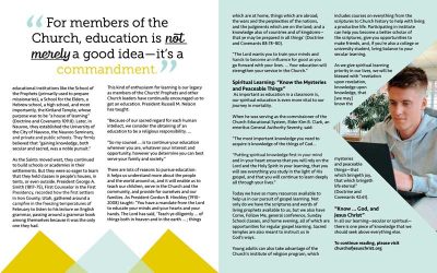
One of my dreams is to work for The Church of Jesus Christ of Latter-day Saints. Their communications and media departments are world class. Everything that is produced is professional and has been crested with great care. I was thrilled with the idea of creating a...
Kansas City Icon Set
My goal was to create a graphic design project that reflected where I was from. I’ve been living in Kansas City for the past 7 years and call it home. It is a city rich in culture, history, and pride. I decided that I would create four icons that represent Kansas...
¡Viva Chile Sticker Set!
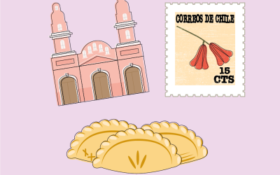
I wanted to make stickers that were both cute and represented something important to me! Stickers that I could not find anywhere else. I started brainstorming ideas and remembered my mission! I served as a missionary of The Church of Jesus Christ in Rancagua, Chile. I...
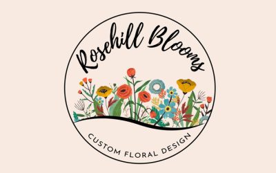
Rosehill Blooms Redesign
Meet Wendy! She is a stay-at-home mom who loves Dr. Pepper, running, and watching true crime. After 20 years she is finally putting her floral design and horticulture degree to use! It all started from home making corsages and boutonnières for her children’s friends....

