The Band Navie – Gig Poster
I was tasked to create a gig poster for the imaginary band “Navie.” They are a girl band that writes country love songs. My goal for the poster was that the audience would immediately recognize that the poster is promoting a country band. My second objective for this poster is that it reflects a feeling of love and happiness. To accomplish this goal, I knew I wanted the colors to be warm toned and consist of primarily pinks, red, and oranges to represent love and happiness. When I thought about this band I imagined open plains, flower fields, and simple beauty. I thought about a cowgirl and the plaid shirt she might wear. I took all these ideas and combined them together as my inspiration.
To the Drawing Board!

I began sketching ideas as they came to mind. I started at a rough sketch of what I wanted my overall design to be. I drew different variations of the boots. While I was sketching out the flowers I had the thought, what if the flowers were made from hearts? I liked this idea and ran with it! I and started trying to draw harts in different ways, shapes and forms. Little by little I had a better vision for the design. I drew a plaid background and then thought, what if it looked like burlap? I liked that and decided to use a burlap texture in my design. I also thought of other things that could be incorporated into the design such as a cactus or a tumble weed.
After that I imported my sketches into Illustrator and used a few reference photos of burlap and boots. In my sketches I had originally planned for the checked burlap to make up the background of poster. However, I realized that the pattern made it difficult to read the text. I also tried to think of different compositions. So, I started trying out new ideas. This is what I came up with:

Feedback & Improvement
I did not like this first design and knew I had to change something. I was encouraged to try new angles and different compositions so I started drafting again and came up with these rough drafts.


After getting some feedback on the first design I realized that this design was very busy and had to much going on. Part of the feedback I received was that the colors were too saturated and that the dark checkered print background was too busy and bold against the text. Additionally, I was told to simplify the flower stems and overall organize all the elements of the design better.

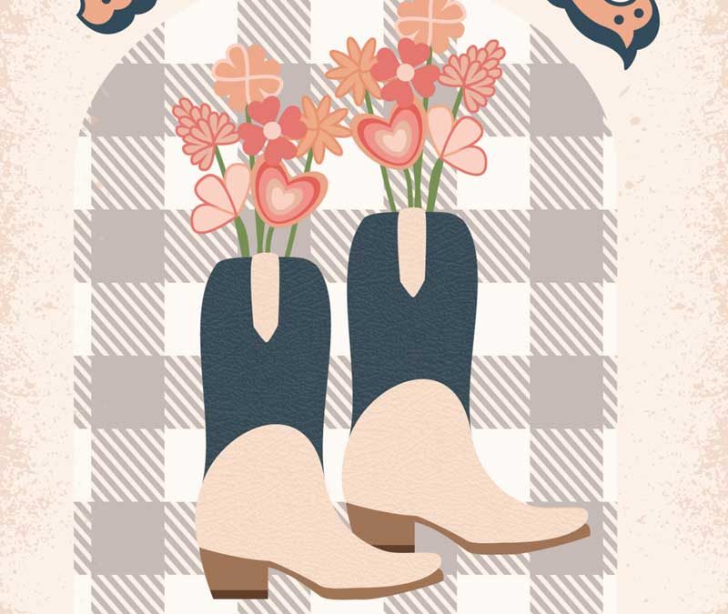
Applying the feedback, I decided to go back to something similat to my original version. I inverted the checkered print and the solid color background so that it was not overbearing. I changed the colors so that they were not as saturated. I also changed the color, transparency, and opacity on the checkered print background so that it was not as contrasted and bold. I also worked on simplifying the flower stems by making them into straighter lines. I also edited some of the flowers so there were not as many minute details and tangents. I tried a lot of different boot styles but liked the way the navy-blue ones looked and matched the name. I centered the checkered print pattern to make sure it was evenly spaced within the arch and aligned everything else to that. Last I added a slight leather texture to each part of the boots and a splatter effect on the sides of the poster. This was my final result…
Drumroll Please… The Final Result!

I am happy with how my design turned out! You can see a lot of progress from the beginning to the end. At the beginning a few of my goals were to create a poster that was immediately recognizable as country. That is accomplished by the boots and checkered print background and arch. I also wanted to create feelings of love and happiness. That is done by the primarily warm tones colors and heart shaped flowers. I also LOVE the font that I found! It is both feminine and very country, which ties the entire design together perfectly!
0 Comments