Converse Ad Design
This advertisement was a part of the 2012 converse ad campaign, “Shoes are boring. Wear sneakers.” The main purpose of this campaign is to persuade people that shoes are boring, common, and safe. However, sneakers are fun, outgoing, risky, and daring. Teens and young adults that are fun and cool wear sneakers! All the photos in this campaign ad depict converse wearers doing crazy, edgy things. The sneakers all have a worn, dirty look to them. These advertisements were created to target male and female teenagers and young adults. According to workingnotworking.com this campaign was run in over 70 countries and “led to the brand’s best sales numbers ever.”

Color
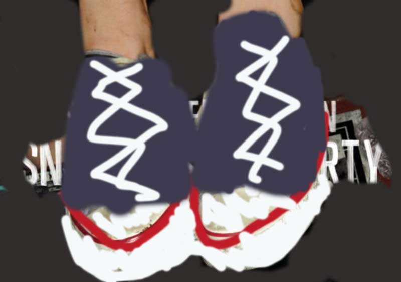
The original ad is very dark. Everything has a black shadow around it except for the Converse in the center. The main colors that stand out in this ad are red, blue, and white. The color, darkness, and grainy look to the photo give this advertisement a very retro aesthetic. Although red and blue are typically bright, bold colors they are muted in the original ad. The bright white text pops against the dark background and makes the headline stand out even more.
Typography
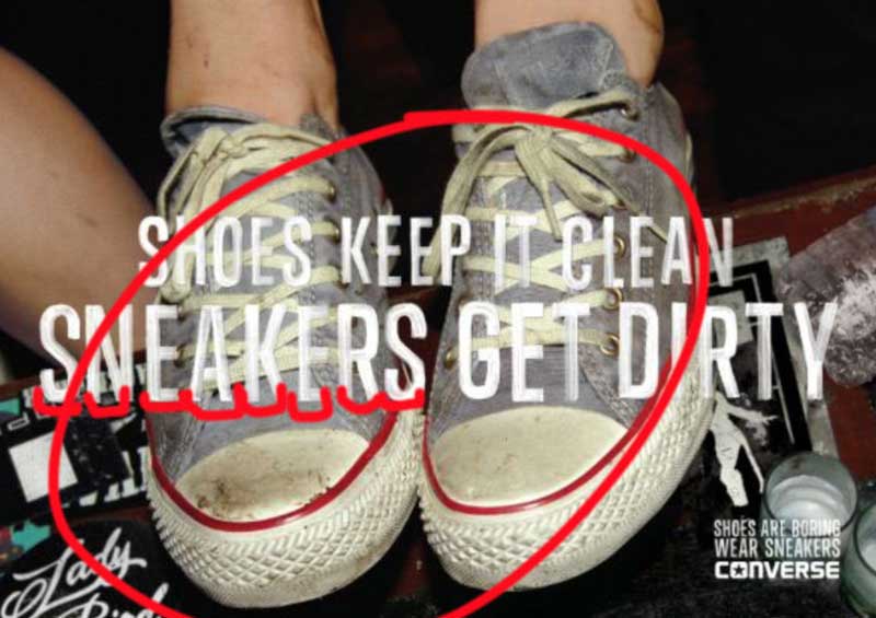
All of the text in the original ad is in the same font. It is a Sans Serif type face because it lacks the extra stokes at the ends of the letters and is monoweight. It is very straight, clean and modern. However, it also has elements of a decorative typeface as well. The font looks like paint or a marker. There are parts where the text is more opaque. It is a very style specific font. I think that this was a specific design choice that contributes to the rough, street-style look of this advertisement.
Design

The design principles of proximity & alignment work together in this advertisement. There are two large size lines in the center of the advertisement that make up the headline. These two lines are close together in proximity, meaning they have a relation to one another. And they do! The proximity of the two lines lets the reader know subconsciously that they are meant to be read together. The center alignment on this large set of text is bold and makes the text stand out. In contrast, the campaign title in the bottom right corner is small and does not align with the headline. The difference in size in combination with the difference in alignment signals that this information is less important. It does not stand out; rather it sinks into the background almost unnoticed. Furthermore, these two sections of text have a large proximity, meaning they are really far away from one another. This distance means the two sections are not correlated and should not be read together. The designer made the most important message (the headline) have the closest proximity, largest size, and gave it a center alignment to make it stand out and be the first thing that the audience reads.
New Ad Design- “Sneakers are Tough”

Color
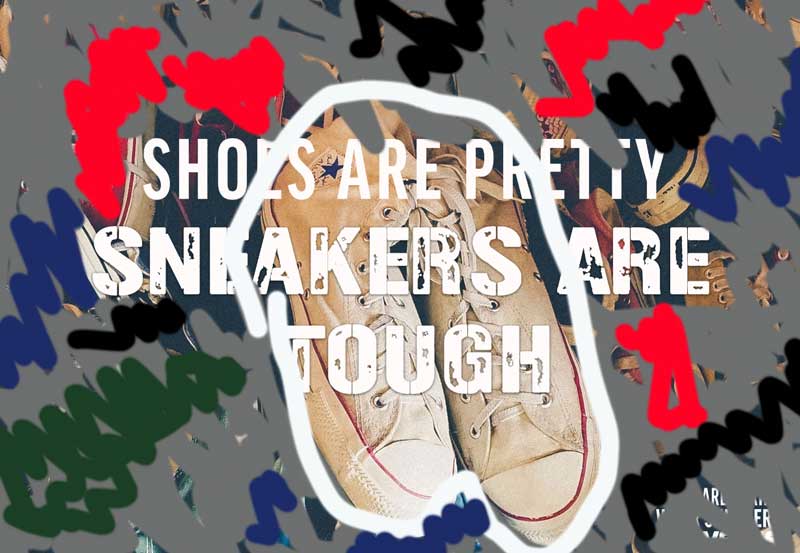
This new ad I created is similar in color. This advertisement has a very rough look to it. The colors are not very vibrant and has an overall dark look to it. The brightest part of the advertisement is the Converse in the center. I tried to replicate that same thing. In the new ad the white, yet dirty, Converse are placed front and center to draw attention. The original ad contains three primary colors, red, blue, white, and then a darker background. The new image I chose also has many of these same colors contained within the various surrounding shoes. As you can see in the draw over the colors are not overly bright and is fairly simple.
Typography
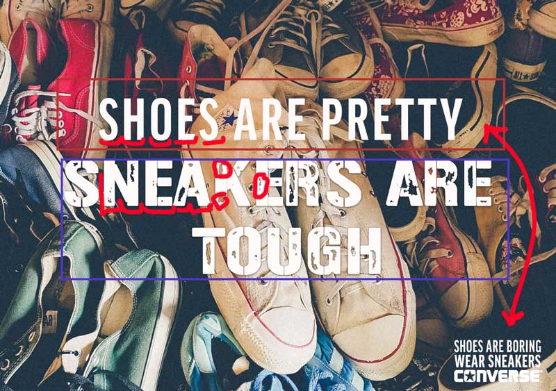
I could not find the exact same font for the new advertisement, however I tried to find similar styles. In the new ad creation, I used two different typefaces for the headline. The first line is a Sans-Serif font that is tall and thin like the original. However, the original typeface looks like it was written with a thick marker. There appears to be little brush strokes and parts where the letters are opaquer. That is why I decided to use a decorative font for the second and third lines. Part of the text is opaque, and it has a much bolder, rough-tough look to it. I think this different font helps draw attention to the message that sneakers are tough and cool. Then, for the small campaign title in the bottom left corner I used the same Sans Serif font from the first line, that is like the original ad.
Design
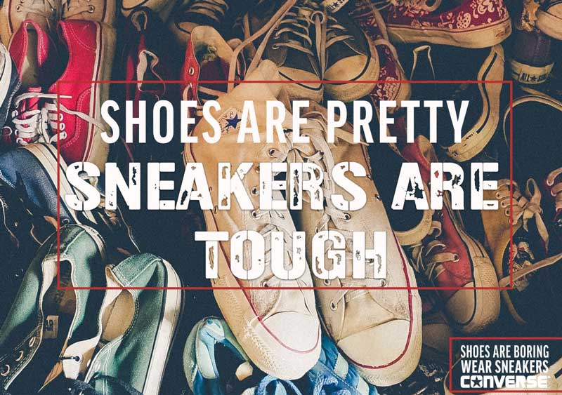
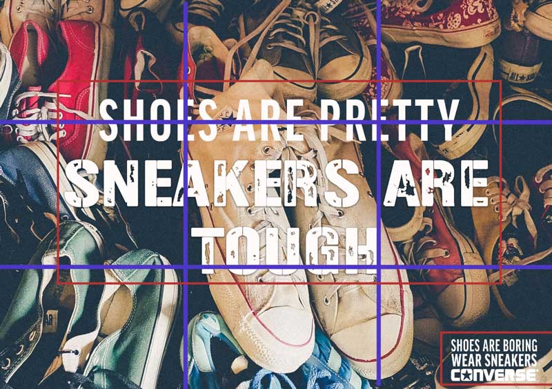
I also mimicked these same design principles of alignment and proximity in the new design. Like the draw over photo of the original advertisement, this new one has the headline all close together. Even though there are two different typefaces, it is the proximity that lets the audience know that the three lines are related and read together. Then there is the same campaign slogan that is far way away from the rest of the text. This large proximity creates a separate thought/idea. Finally, like the previous advertisement there is the alignment. Like the blue lines depict, not only is the headline aligned in the center of advertisement, but the Converse in the background are directly placed in the center as well. The main subject in the original Converse ad are the sneakers. The sneakers are given extra attention by literally placing them front and center. The product is the most important thing in any advertisement, and the creators want to make sure it is the main focus of attention.
Summary
In conclusion, the original ad design and the new design could effectively be in the same campaign because of how the elements of color, typography, and design work together. Both advertisements have an old retro feeling to the photo. Each photo has a pair of converse placed in the center. The converse are the center of attention in the advertisement and the brightest part of the background. The rest of the surrounding background is much darker. Then, the text is written in similar style typeface as well. Both body copies send the audience the message that Converse sneakers are for cool people. Finally, the same design elements of alignment and proximity are also used in both advertisements.

0 Comments